I used to think transitional design was just a cop-out—like, pick a lane, you know?
But here’s the thing: after spending way too many hours in showrooms and flipping through design portfolios that all started blending together, I realized transitional interiors aren’t about indecision at all. They’re about something way more interesting—creating spaces that feel both grounded in history and completely liveable for how we actually exist now. The style emerged sometime in the late 1990s, maybe early 2000s (the timeline gets fuzzy depending on who you ask), when designers started noticing that pure contemporary felt cold to a lot of people, while strict traditional seemed, well, like your grandmother’s house. Not that there’s anything wrong with grandmothers’ houses, but most of us don’t want to live in museums. Transitional design basically said: what if we kept the good bones of classic interiors—the craftsmanship, the proportions, the sense of permanence—but stripped away all the fussy details that make you afraid to actually sit on the furniture?
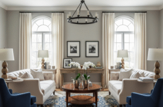
The color palette tells you everything you need to know about this approach. Neutrals dominate—think warm grays, soft taupes, creamy whites—but not in that boring contractor-beige way. These are layered neutrals with depth, the kind that shift slightly depending on the light hitting them.
The Furniture Balancing Act That Actually Works in Real Spaces
Honestly, furniture selection is where transitional design either sings or falls completely flat.
You’re looking for pieces with clean lines—no ornate carvings or excessive embellishment—but they need weight and substance, not that flimsy contemporary stuff that feels like it might collapse if you look at it wrong. A classic Chesterfield sofa might get reupholstered in a smooth linen instead of tufted leather. A traditional wingback chair loses its skirt and gains sleek wooden legs. I’ve seen dining tables that could’ve come from a 19th-century farmhouse paired with chairs so modern they look like they belong in a Scandinavian design magazine, and somehow—wait, maybe it’s the similar wood tones?—it works. The trick seems to be maintaining consistent scale and proportion even when you’re mixing eras. Everything needs to feel like it belongs to the same weight class, even if the styles are from different centuries.
Texture Becomes the Secret Language When Pattern Steps Back
Since transitional spaces tend to avoid bold patterns (florals are definately out, geometric prints are used sparingly), texture does all the heavy lifting.
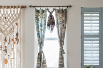
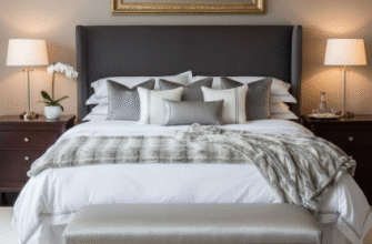
A room might layer linen drapes, a wool rug, velvet throw pillows, a leather ottoman, and rough-hewn wooden beams—all in variations of the same neutral color family. The eye stays interested not because of contrasting colors or busy patterns, but because of how light plays across different surfaces. I guess it makes sense: our brains are wired to notice textural variation even when color stays consistent, something about evolutionary advantages for detecting predators in tall grass or whatever. Anyway, the practical upside is that these spaces photograph beautifully but also feel genuinely comfortable to inhabit, which isn’t always true of designer showrooms.
Lighting Choices That Respect Both Eras Without Favoring Either
Lighting in transitional interiors walks this interesting line.
You’ll see traditional forms—chandeliers, sconces, table lamps with recognizable silhouettes—but executed in unexpected materials or finishes. A classic candelabra-style chandelier might be rendered in brushed nickel instead of antique brass, or simplified so it’s got the basic shape but none of the decorative flourishes. Recessed lighting (very contemporary) often works alongside these traditional fixtures, providing the actual illumination while the decorative pieces add visual interest and warmth. I used to think mixing recessed cans with a statement chandelier was conflicting design languages, but turns out it’s just practical—you need both ambient and task lighting, and there’s no rule saying they have to come from the same aesthetic universe. The result is spaces that feel bright and functional without that harsh, clinical quality some modern interiors have.
Architectural Details That Bridge Centuries Without Screaming About It
This is where things get subtle.
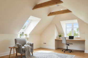
Transitional spaces might have crown molding, but it’s simplified—maybe three inches instead of eight, with clean profiles rather than ornate curves. Baseboards are present but understated. Coffered ceilings lose their heavy beams and become simple geometric recesses. Door and window casings frame openings without demanding attention. The architecture provides structure and visual interest without overwhelming the space or making you feel like you’re in a period drama. I’ve noticed that really successful transitional rooms often have one or two slightly bolder architectural elements—an arched doorway, maybe, or built-in shelving with classic proportions—that anchor the traditional side, while everything else leans cleaner and more contemporary. It’s this push-pull that keeps your eye moving around the room, finding new details instead of taking in everything at once and moving on.
What strikes me now is how this approach actually reflects how most of us live—we inherit furniture from relatives, we buy new pieces when we can afford them, we hang onto things that work even when they don’t match the current aesthetic. Transitional design just does it intentionally, with more thought about scale and color and texture. It’s organized eclecticism, I guess. Or maybe just permission to stop worrying about whether your grandmother’s sideboard ruins your modern vibe—because it doesn’t, if you style it right.

