
I used to think tray ceilings were just those fancy recessed things you’d see in hotel lobbies—something a professional decorator would charge thousands for.
Turns out, painting one yourself is less about precision and more about understanding how light hits angles, which sounds pretentious but actually matters when you’re standing on a ladder at 9 PM wondering why your “sophisticated navy” looks like a bruise. The basic concept is simple: a tray ceiling has a recessed center section, usually a foot or so higher than the perimeter, creating natural borders that beg for color contrast. I’ve seen people paint just the recessed area, just the border trim, or go wild with gradients that would make a sunset jealous. The key thing—and this took me three failed attempts to figure out—is that you’re not just adding color, you’re manipulating perceived room height and width through strategic contrast. Dark centers make the ceiling feel higher but the room cozier; light centers with dark borders create this floating effect that honestly feels a bit like mild vertigo if you overdo it. Paint sheens matter too, maybe more than the actual color sometimes—flat paint absorbs light and recedes, while satin or semi-gloss reflects it and advances toward you visually.
Wait—maybe I should back up and talk about prep work, because that’s where most DIY projects actually fail. You’ll need painter’s tape (the good stuff, not dollar store nonsense), drop cloths, primer if your current ceiling is dark or stained, and a patience reserve you didn’t know you had. Taping the angles where the tray meets the flat ceiling requires a steady hand and good lighting; I use a headlamp because overhead fixtures create shadows exactly where you don’t want them.
Choosing Colors That Actually Work Together Without Looking Like a Kindergarten Project
Here’s the thing about color theory: it’s simultaneously overrated and critically important.
I’ve watched people agonize over whether their accent should be two shades darker or three, then slap up something that clashes with their wall color entirely and wonder why it feels wrong. The science-ish part is that complementary colors (opposite on the color wheel) create high contrast and energy, while analogous colors (neighbors on the wheel) feel harmonious but can read as bland if the value contrast isn’t strong enough. Value—that’s the lightness or darkness independent of hue—is actually more important than the specific color most of the time. A medium gray ceiling with white trim creates dimension; a medium gray ceiling with light gray trim just looks like you ran out of paint. Metallics are tricky because they change dramatically depending on natural versus artificial light, and I’ve definately seen gorgeous Pinterest inspiration photos that turned into disco nightmares under LED bulbs. Test your colors on poster board, tape them to the ceiling, and look at them morning, noon, and evening before committing—boring advice, but it works.
Tools and Techniques That Separate Decent Results From Obvious Amateur Hour
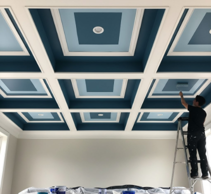
Rollers are your friend for large flat areas, but you’ll need a quality angled brush for cutting in along the tray edges.
The whole “cutting in” thing is just painter-speak for carefully painting a border without tape, which sounds impossible until you practice on a cardboard box for twenty minutes and realize it’s mostly about brush angle and paint consistency. Too thick and it globs; too thin and it drips. I use a small roller with an extension pole for the recessed center because climbing up and down a ladder forty times destroys your knees and your will to live. Here’s something nobody tells you: paint the border trim first if you’re doing multiple colors, let it dry completely (like, actually wait the full cure time, not just until it’s dry to touch), then tape over it to protect it while you do the center. Going the other direction means you’re trying to tape a crisp line on a textured ceiling, which is how you end up with bleed-through and rage.
Dealing With Texture, Popcorn Ceilings, and Other Architectural Crimes Against Humanity
Popcorn ceilings are the worst, but they exist in roughly 40% of homes built between 1950 and 1990, so here we are. Painting over texture requires more paint than you think—it absorbs into all those little peaks and valleys—and a thick nap roller, maybe 3/4 inch instead of the usual 1/2 inch. Don’t roll back and forth aggressively or you’ll scrape off chunks of texture, which creates bald spots that look terrible and also possibly release asbestos if your house is old enough, so maybe test for that first actually. Some people scrape popcorn ceilings before painting tray details, which is a valid choice but generates approximately one billion particles of dust-debris that coat everything you own. I tried it once and found ceiling grit in my coffee mug three weeks later. If your tray ceiling has crown molding or decorative trim, you’ve got another decision: paint it the same color as the border for continuity, or treat it as a separate accent element. There’s no universal right answer, which is both liberating and infuriating.
Lighting Considerations That Nobody Mentions Until After You’ve Already Painted Everything Wrong
Anyway, if you have recessed lighting in your tray ceiling, the paint color will interact with the light color temperature in ways that seem designed to drive you insane.
Warm white bulbs (2700-3000K) make blues look greenish and can muddy cool grays; daylight bulbs (5000K+) make warm colors look washed out but render cool tones accurately. I guess it makes sense from a physics standpoint—you’re essentially layering colored light onto colored paint—but it’s still annoying to recieve this information after you’ve already bought five gallons of “Tranquil Spa Blue” that now looks like moldy seafoam. Dimmers help because you can adjust intensity to find a sweet spot where the color looks intentional instead of accidental, but they’re not magic. If you’re painting a bedroom tray ceiling, remember you’ll mostly see it while lying down, which changes the viewing angle and how shadows fall across the recessed area compared to standing in the doorway. I painted my guest room ceiling a gorgeous deep charcoal that looked sophisticated during the day and actively oppressive at night until I added cove lighting around the perimeter—which I should have planned for originally but didn’t because planning is for people with better executive function than me.
Budget Reality Checks and When to Just Hire Someone Already
Paint costs between $30-80 per gallon depending on quality, and you’ll need maybe two gallons total for an average 12×14 room tray ceiling if you’re doing two colors with good coverage.
Supplies—tape, brushes, rollers, drop cloths, primer—add another $50-100 if you’re starting from nothing. A professional painter would charge somewhere between $300-800 for the same job depending on your region and the ceiling’s complexity, which honestly isn’t that much more when you factor in your time and the psychological cost of discovering you hate the color after living with it for three days. Here’s my actual advice: if your tray ceiling is simple and you enjoy meditative repetitive tasks, DIY it. If it has multiple levels, complex molding, or you have perfectionistic tendencies that will make you repaint seventeen times, just hire someone and spend your weekend doing literally anything else. The emotional dimension of home improvement projects is real—I’ve seen people ruin relationships over bathroom tile choices—and sometimes the best decision is recognizing your limits before you’re crying on the floor surrounded by paint cans at midnight wondering why you thought you could do this.


