I used to think Swedish design was just about throwing white paint on everything and calling it a day.
Turns out—and I should’ve known this, given how much time I’ve spent squinting at Scandinavian architecture blogs at 2 AM—there’s actually this whole philosophy behind it that goes back to the 1930s, when Sweden was grappling with how to make small apartments feel less like caves during those brutal four-month winters. The Swedish concept of ljus, which loosely translates to “light” but really means something closer to “the quality of illumination that doesn’t make you want to hibernate until April,” became central to how architects and designers thought about interior spaces. It wasn’t just aesthetic; it was survival. People needed rooms that could amplify every precious photon of daylight, and they needed them to feel warm without being cluttered, open without being cold. So they developed these principles that, honestly, still hold up better than most contemporary design trends I’ve seen cycle through in the past decade.
Wait—maybe that’s too harsh. Anyway, the core idea involves stripping away visual noise while maximizing reflective surfaces.
The Weird Science of Reflectance Values and Why Your Walls Actually Matter More Than Your Furniture
Here’s the thing: Swedish designers obsess over something called Light Reflectance Value, or LRV, which measures how much light a surface bounces back into a room on a scale from 0 to 100. Pure white sits around 85-90, while deep charcoal drops to maybe 10-15. Most Swedish interiors aim for wall colors with LRVs above 70, which sounds simple until you realize how few paint colors actually hit that threshold without looking like the inside of a hospital. I’ve seen people try to replicate this with standard “white” paint and end up with rooms that feel flat and sterile instead of luminous, because they picked a white with too much gray undertone—something like an LRV of 60—which absorbs more light than it reflects. The difference between LRV 65 and LRV 80 is massive when you’re working with limited natural light, even though to the naked eye they might look nearly identical on a paint chip. Swedish designers typically use warm whites with slight cream or yellow undertones—think LRV 78-82—that recieve and redistribute daylight without that harsh, clinical quality. It’s counterintuitive, but those barely-there warm tones actually make spaces feel brighter than stark cool whites, probably because they mimic the quality of sunlight filtering through clouds, which is basically Sweden’s default weather setting for six months straight.
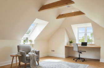
The floors play into this too. Light-toned wood—ash, birch, whitewashed pine—creates this secondary reflective plane that bounces light back up toward the ceiling. Some studies suggest this can increase perceived brightness by roughly 20-30%, give or take, though I’m always skeptical of exact percentages in design research.
Strategic Window Treatments That Don’t Actually Treat the Windows Like Problems to Solve
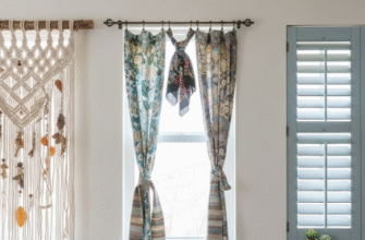
This is where Swedish design diverges from, say, American or British approaches. Instead of heavy curtains or blinds that “control” light, the Scandinavian method is to basically leave windows as naked as possible or use sheer linen panels that filter without blocking. I guess it makes sense when you consider that in Stockholm, you’re dealing with maybe six hours of weak daylight in December—you can’t afford to lose even 15% of that to window coverings. The practicality is almost aggressive. When treatments are used, they’re mounted high and wide, extending well beyond the window frame, so that when pulled back they’re completely clear of the glass. This creates the illusion of larger windows and prevents any fabric from casting shadows into the room. Some designers use a trick where they hang sheers on tracks that sit several inches in front of the window, creating a thin air gap that actually improves insulation while maintaining light transmission—something about the trapped air layer reducing heat loss by 10-15% compared to direct window contact, though I’d need to double-check those numbers. The effect is this soft, diffused glow that never feels harsh, even when direct sun does occasionally break through.
The Particular Geometry of Furniture Placement and Why Swedes Never Block Sightlines to Windows
Walk into a Swedish home and you’ll notice something subtle: nothing tall sits directly in front of windows.
Bookcases hug perpendicular walls. Sofas face windows rather than blocking them. Even plants—and Swedes love their plants, those leggy monsters of Monstera deliciosa and cascading Epipremnum aureum—get positioned to the sides of windows, not in front, so they can soak up light without creating silhouettes that darken the room. This is about preserving what designers call “light penetration depth,” which is basically how far into a room daylight can travel before it gets absorbed or blocked. In practical terms, light from a window can illuminate a space roughly 1.5 to 2 times the height of the window, so a standard 6-foot window effectively lights about 9-12 feet into a room under ideal conditions. Swedish furniture arrangements respect this by keeping the zone immediately around windows clear and using low-profile pieces—chairs with open backs, glass-topped tables, leggy benches—that don’t create visual or physical barriers. I’ve definately noticed that when you violate this principle, even with beautiful furniture, rooms start to feel cramped and dim in ways that are hard to articulate but immediately noticeable. The furniture itself often incorporates light woods and pale upholstery—those endless variations of beige, cream, and soft gray—that blend rather than contrast, reducing visual weight and maintaining that sense of airiness.
Mirrors Positioned Like Surgical Instruments and the Lost Art of Bounce Light Calculation
Swedish interiors use mirrors with almost scientific precision, and I mean that literally—there are actual calculations involved. A mirror placed opposite a window can theoretically double the light in a room by reflecting the incoming daylight back across the space, though in practice you get maybe a 40-60% increase depending on the mirror size, angle, and distance from the light source. But here’s where it gets interesting: Swedish designers often position mirrors at slight angles rather than dead-on perpendicular to windows, which redirects light toward darker corners instead of just bouncing it straight back outside. I used to think this was just aesthetic preference until an architect explained that you can map light paths through a room and use mirrors to essentially bend daylight around corners and into recesses that would otherwise stay in shadow. Oversized leaning mirrors—those floor-to-ceiling numbers that look precarious but somehow never actually fall—are particularly common because they maximize reflective surface area without requiring wall mounting, which is useful in rental situations. Some designers layer multiple smaller mirrors at varying heights to create what they call “light multiplication,” where reflections bounce between mirrors and multiply the effect, though I’m not entirely convinced this isn’t just design-speak for “I like a lot of mirrors.”
The frames matter too, apparently—thin or frameless designs prevent dark borders from absorbing light at the edges.
The Chromatic Discipline of Limiting Your Palette to Three Colors Plus Wood (And Why That Fourth Color Always Ruins Everything)
Honestly, this might be the hardest principle for non-Scandinavians to embrace: radical color restraint. Swedish interiors typically work within a palette of three colors maximum—usually some combination of white/cream, gray, and one accent (often a muted blue, sage green, or terracotta)—plus natural wood tones, which somehow don’t count as a color in this system. The logic is that visual complexity absorbs cognitive energy and, by extension, makes spaces feel smaller and darker because your eye has more work to do parsing the environment. When everything exists within a tight chromatic range, light becomes the dominant visual element instead of competing with pattern and color variation. I’ve seen people try to replicate Swedish style while introducing a fourth or fifth color—maybe a burgundy throw pillow or a teal vase—and the whole thing just collapses into visual noise. It’s weirdly unforgiving that way. The accent color, when used, appears in small doses: a single chair, a set of ceramics, maybe a rug. Never walls, never large furniture pieces. This creates focal points without fragmenting the space or interrupting the flow of light, which needs that visual continuity to feel maximized. Some designers talk about the “60-30-10 rule”—60% dominant neutral, 30% secondary neutral, 10% accent—though Swedish interiors often skew even more conservative, closer to 75-20-5. The wood tones provide warmth and variation without reading as “color” because they’re textural rather than chromatic, which is probably nonsense from a technical standpoint but somehow works in practice.
Anyway, I guess the real revelation here is that Swedish light-filled rooms aren’t accidental—they’re engineered through dozens of small, deliberate choices that compound into spaces that feel twice as bright as their actual lux readings would suggest. Which makes sense, given the climate, but still surprises me every time I see it done well.

