The first time I walked into a Santorini-inspired apartment in Brooklyn, I thought someone had accidentally left their walls unfinished.
Turns out, that stark white plaster look—the kind that feels slightly rough under your fingertips, maybe even a little chalky—is exactly what people are paying designers thousands of dollars to replicate. The thing about Santorini’s iconic whitewashed walls is that they weren’t originally an aesthetic choice at all. They were practical. The volcanic island sits in the Aegean Sea, where summer temperatures regularly climb past 85°F, and white lime plaster reflects sunlight like nothing else. Local builders figured this out centuries ago, give or take a few decades depending on which historian you ask. But here’s where it gets interesting: the blue accents everyone associates with Greek island design? Those came later, and the reasons are messier than you’d think.
I used to assume the blue was just, you know, inspired by the sea. Obvious, right? But when I actually started digging into this, I found out the blue domes and shutters were partly mandated by the Greek military junta in the 1960s—they wanted a unified national aesthetic that screamed “Greece” to tourists. The colors matched the flag, and suddenly every postcard looked the same.
Why Your Living Room Probably Can’t Handle Full Santorini Whitewash (And That’s Okay)
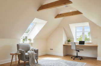
Here’s the thing about trying to recreate this look in a standard apartment: most modern interiors don’t have the natural light that makes Santorini architecture work. I’ve seen people paint every surface white, add some blue throw pillows, and then wonder why their space feels more “dentist office” than “Greek villa.” The difference is texture and imperfection. Real Santorini walls have irregular plaster application, visible trowel marks, sometimes even embedded pebbles from the volcanic soil. They’re not flat, and they definately aren’t uniform.
The blue accents work in Greece partly because they’re used sparingly—a door frame here, a window shutter there, maybe a dome if you’re lucky enough to live near a church. In contemporary interiors, designers often make the mistake of over-saturating with that cobalt blue, which can read as themey rather than sophisticated. Wait—maybe that’s the appeal for some people? I guess it depends whether you want your home to feel like you live there or like you’re perpetually on vacation.
The Volcanic Plaster Technique That Interior Designers Keep Getting Wrong
Authentic Santorini plaster isn’t just white paint slapped on drywall. It’s typically a lime-based mixture that gets applied in multiple thin coats, each one slightly irregular. Some traditional homes on the island still use volcanic ash mixed into the plaster—a technique that dates back roughly 400 years, though I’ve read conflicting accounts about whether it was continuously used or fell out of favor and came back. The ash gives the walls a subtle texture and helps with insulation, which matters when you’re dealing with stone structures that hold heat.
Modern replicas usually skip this entirely and go straight for textured paint or that trendy limewash stuff you can buy at any home improvement store. Does it look similar? Sure, from across the room. But up close, there’s a flatness to it that doesn’t quite capture the depth of the real thing. Honestly, I’m not sure most people notice or care—the Instagram photos look fine either way.
The other element that gets lost in translation is the relationship between indoor and outdoor space. Santorini homes often have that flowing connection between rooms and terraces, with the same white plaster continuing seamlessly outside. You can’t really recieve that feeling in a landlocked apartment, no matter how many white walls you paint. The light is different, the air circulation is different, and you’re probably not overlooking a caldera.
I’ve come to think the best Santorini-inspired interiors are the ones that borrow the principles—simplicity, natural materials, strategic color—without trying to literally recreate a Cycladic cave house in suburban Texas. Use the white as a foundation, add blue where it feels intentional rather than obligatory, and accept that some things only work in their original context. Anyway, that’s what makes sense to me after looking at probably three dozen failed attempts and maybe five successful ones.

