I used to think minimalism was just about throwing everything away.
Turns out, it’s more complicated than that—minimalist interior design isn’t really about deprivation or living in some sterile, magazine-perfect space that nobody actually inhabits. It’s about intentionality, which sounds like a buzzword until you actually try it. The principle goes something like this: every object in your space should either serve a function or bring you genuine joy, and ideally both. When I first started researching this for a piece years ago, I interviewed maybe thirty people who’d gone minimalist, and the thing that struck me was how many of them talked about feeling lighter, not just physically but mentally. One woman in Portland told me she used to spend roughly twenty minutes every morning just looking for her keys. After decluttering, that anxiety just… evaporated.
Here’s the thing: minimalism isn’t one-size-fits-all. Some people keep two plates, others keep twenty. The core idea is intentional curation.
Anyway, the first principle worth understanding is what designers call “negative space”—basically, the empty areas in a room that give your eyes somewhere to rest. In Western culture, we’re conditioned to fill every corner, every surface, but negative space is where minimalist design actually breathes. I’ve seen apartments in Tokyo where a single vase on a low table becomes the focal point of an entire room, and it works because there’s nothing competing for your attention. The Japanese have this concept called “ma,” which loosely translates to the space between things, and it’s considered just as important as the things themselves. When you start thinking about emptiness as an active design element rather than something to be filled, the whole approach shifts. You stop asking “what else can I add here” and start asking “what can I remove without losing function or beauty.”
The second principle is about color palettes, which honestly can make or break the whole vibe.
Why Neutral Tones Actually Create Visual Complexity Instead of Boredom
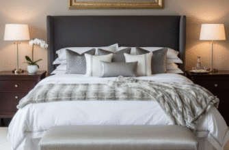
Wait—maybe that sounds counterintuitive, but stick with me. Minimalist spaces typically use neutral base colors: whites, grays, beiges, soft taupes. But here’s what people miss: neutrals aren’t flat. A good minimalist palette might include six or seven different shades of white, each with slightly different undertones—warm whites that lean toward cream, cool whites with blue undertones, chalky whites that feel almost gray in certain light. This creates depth without visual noise. I guess it’s like… imagine a black-and-white photograph versus a color snapshot. The monochrome image forces you to notice texture, shadow, composition. Same principle applies to interiors. When you remove the distraction of competing colors, you start noticing the grain of wood, the weave of linen, the way afternoon light hits a concrete wall.
One architect I interviewed in Copenhagen told me she specifies paint samples by testing them at different times of day, which seemed excessive until I tried it myself and realized how dramatically a “simple” gray can shift from warm to cold depending on the light.
Furniture Selection Based on Multi-Functionality Rather Than Single-Purpose Pieces
This is where minimalism gets practical rather than just aesthetic. The idea is that every piece of furniture should earn its place by doing more than one job. A coffee table with hidden storage. A sofa bed for guests. Dining chairs that stack. Wall-mounted desks that fold away. I used to think this was just about saving space, and sure, that’s part of it, especially in urban apartments where square footage costs a fortune. But it’s also about reducing decision fatigue—when you own fewer things, you spend less mental energy managing them. There’s actually some research from Princeton suggesting that physical clutter competes for your attention, making it harder to focus. Whether you buy that or not, the multi-functionality principle definately makes sense from a purely economic standpoint: why buy three pieces of furniture when one well-designed item can do the work of all three?
Material Honesty and the Tactile Experience of Unadorned Surfaces
Here’s something I didn’t expect to care about: texture.
Minimalist design tends to emphasize natural, unfinished materials—raw wood, exposed concrete, linen, wool, stone, brushed metal. The philosophy is about material honesty: letting materials look like what they actually are instead of disguising them. No fake wood-grain laminate pretending to be oak. No plastic molded to imitate marble. This creates spaces that feel grounded and authentic, which might sound like more design-speak, but there’s something genuinely calming about touching a wooden table and feeling actual wood grain under your fingers. It’s a sensory thing. One interior designer in Melbourne told me that she deliberately leaves some surfaces slightly rough—a concrete counter with a subtle texture, linen curtains that wrinkle naturally—because perfection feels cold. The imperfections remind you that you’re in a space made of real materials, not a computer rendering. I’ve noticed this in my own apartment: the worn leather of my desk chair, the slight variations in my ceramic mugs. These small tactile details matter more when there’s less visual competition.
Strategic Lighting Layers That Transform Space Throughout the Day
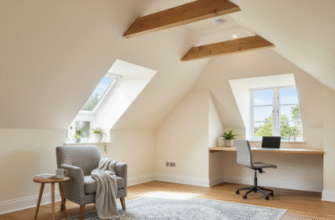
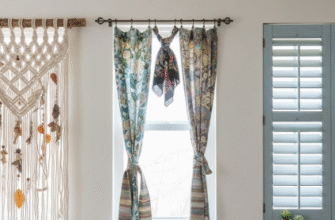
Lighting is where most people mess up minimalist design, honestly. They install one overhead fixture and call it done. But minimalist spaces need layered lighting—ambient, task, and accent—to avoid feeling flat or institutional. Think about it: a room with only overhead lighting looks like a waiting room. You need table lamps for reading corners, pendant lights over dining areas, maybe LED strips for subtle accent lighting, dimmers to adjust mood. Natural light is obviously the holy grail here, and minimalist design tends to maximize it: large windows, sheer curtains instead of heavy drapes, mirrors positioned to bounce light around. I visited a minimalist home in Vancouver once where the architect had installed skylights in the hallway, which seems extravagant until you experiance how it transforms a transitional space into something you actually want to linger in. Lighting can recieve less attention than furniture or color, but it’s maybe the most important element. Same room, different lighting: completely different emotional resonance.
The endurance of minimalist design—it’s been trendy for what, twenty years now?—probably says something about how overwhelming modern life feels. When everything else is chaotic, coming home to simplicity feels like exhaling.

