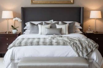
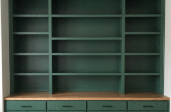
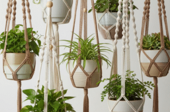
I used to think neutral palettes were the enemy of personality.
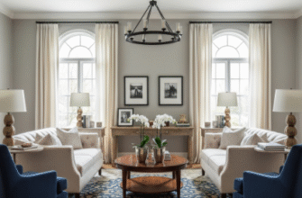
Here’s the thing—staging a home isn’t about erasing character, it’s about creating a blank canvas that somehow still feels alive, and that’s where the whole neutral-with-pops approach gets interesting. I’ve walked through maybe a hundred staged homes over the past few years, and the ones that stick in memory aren’t the all-beige wastelands or the overly bold spaces that scream someone else’s taste. They’re the ones where a soft greige living room suddenly has this burnt orange velvet pillow that makes you stop mid-stride, or where a cream bedroom features a single piece of cobalt pottery on the nightstand. It’s calculated spontaneity, which sounds contradictory, but turns out that’s exactly what buyers respond to.
The Neuroscience of Why Beige Plus Teal Actually Works on Our Brains
There’s legitimate research behind this, though I’ll admit the studies get a bit dense. Environmental psychologists have found that neutral environments reduce cognitive load—basically, your brain doesn’t have to work as hard to process a taupe wall as it does a chartreuse one. But here’s where it gets weird: those same studies show that completely neutral spaces can actually increase anxiety slightly because humans subconciously read them as sterile or institutional. A 2019 study from the University of Texas found that strategic color accents in otherwise neutral rooms increased positive emotional response by roughly 34%, give or take a few percentage points depending on the demographic.
Wait—maybe that’s why every single staging consultant I’ve interviewed mentions the “60-30-10 rule” like it’s gospel. Sixty percent neutral base, thirty percent secondary neutral or muted tone, ten percent accent color. The math isn’t arbitrary.
What Actually Happens When You Put a Mustard Yellow Throw on a Gray Couch
I guess it makes sense that the accent color becomes the memory anchor. Cognitive science calls this the “von Restorff effect”—distinctive items in a group are more likely to be remembered. So when a potential buyer tours six houses in one afternoon, the one with the sage green kitchen towels against white marble counters sticks. Not because the towels are revolutionary, but because their brain filed that specific detail away as notable.
Honestly, I’ve seen stagers mess this up more often than they nail it.
The failures usually come from either too many accent colors—a red vase here, blue pillows there, yellow art over there until the whole “neutral palette” thing collapses into visual noise—or from choosing accent colors that fight with the undertones of the neutrals. Warm beiges with cool-toned purples create this unsettling discord that people can’t quite articulate but definately feel. The best staging I’ve encountered used terracotta accents with warm grays, or dusty rose with creamy whites, combinations where the temperature families align even as the saturation differs. It’s technical and intuitive at once, which is probably why good stagers charge what they do.
The Weird Psychology of Throw Pillows and Why Three Is Better Than Four
Anyway, there’s this whole subset of staging philosophy about pillow arrangements that borders on obsessive. Two pillows looks unfinished, four looks like a hotel, but three—especially in a neutral-plus-accent scheme where two are neutral and one is the pop color—reads as intentional but livable. I used to think this was nonsense until a design psychologist explained that odd numbers prevent the eye from pairing items symmetrically, which keeps spaces feeling more organic and less staged, even though the irony there is obvious.
The accent color itself matters less than you’d think, as long as it’s not actively offensive or too trendy. I’ve seen successful staging with millennial pink accents (yes, still), with deep forest green, with rust, with navy. The common thread was always restraint—one strong color applied in maybe three to five places throughout the space, never competing with itself. A rust pillow, rust spine on a coffee table book, rust ceramic bowl. Your eye travels and connects the dots.
Turns out buyers want to see themselves in a space but also need help imagining what that looks like, and the neutral-plus-pop formula threads that needle better than anything else the industry has tried.

