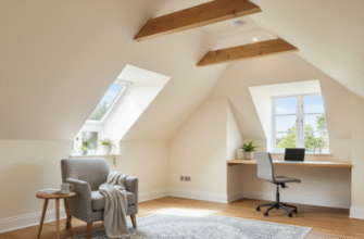
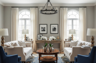
I used to think lighting was just about making sure you could see where you were going—flip a switch, problem solved.
Turns out, when you’re trying to sell a house, lighting becomes this whole orchestrated thing, almost theatrical in how deliberate it needs to be. I spent an afternoon with a stager in Portland last year who walked through a 1970s ranch house with what I can only describe as the intensity of a cinematographer scouting locations. She kept squinting at corners, muttering about “shadow pockets” and “dead zones,” and honestly? I thought she was being a bit extra. But then she started swapping out fixtures and repositioning lamps, and the whole place just… opened up. Rooms that felt cramped suddenly had depth. That weird alcove by the stairs became, somehow, interesting. The house sold in nine days, which—given the market at the time, give or take a few weeks of typical listing periods—was pretty remarkable. Here’s the thing: most people don’t consciously notice good lighting, but they definately feel it, and that feeling translates directly into whether they can imagine living there.
Anyway, the first rule seems to be layering.
The Three-Layer System That Actually Makes Rooms Feel Bigger (Or At Least Not Like Sad Caves)
Professional stagers talk about ambient, task, and accent lighting like it’s some kind of holy trinity, and I guess it makes sense once you see it in action. Ambient is your overhead stuff—the general wash that keeps you from bumping into furniture. Task lighting is functional: the reading lamp, the under-cabinet strips in the kitchen, the vanity lights that prevent you from doing your makeup in what essentially amounts to a horror film. Accent lighting, though, that’s where things get interesting, maybe even a little manipulative in a way I find fascinating. It’s the uplight behind the fiddle-leaf fig, the picture light over the mediocre art that suddenly looks less mediocre, the LED strip tucked under the floating shelves. What happens when you combine all three is this sort of dimensional quality—shadows recede where you don’t want them, surfaces catch light where you do, and suddenly that builder-grade living room has texture and, I don’t know, personality? I watched one stager use a $30 clip lamp aimed at a textured wall, and it created more visual impact than the $400 chandelier hanging in the center of the room. The chandelier was pretty, sure, but it flattened everything. The clip lamp revealed the wall’s imperfections in a way that somehow made them appealing, almost intentional.
Wait—maybe the more important thing isn’t the layering itself but where you aim the light.
Directional Tricks That Highlight Architecture (And Hide The Bits You’d Rather Buyers Not Focus On Too Hard)
There’s this technique called “grazing” where you position a light source close to a wall so it skims across the surface at a sharp angle, emphasizing texture—exposed brick, shiplap, even just a wall with a decent paint job can look architectural with the right graze. I’ve seen stagers use this to make a flat, boring wall in a rental condo look like it belongs in a boutique hotel. Conversely, if you’ve got a wall with damage or weird patches, you flood it with diffuse light from multiple angles so shadows can’t form and reveal the flaws. It’s not dishonest exactly, just… strategic. Kitchens benefit enormously from under-cabinet lighting because it eliminates the shadow your body casts when you’re standing at the counter, which makes the workspace feel functional and well-thought-out. Buyers spend a weirdly long time imagining themselves cooking, even if they mostly order takeout, so that perception matters. In bathrooms, vertical fixtures flanking mirrors are better than a single overhead light, which casts shadows under eyes and noses and generally makes everyone look like they haven’t slept in a week—not the vibe you want when someone’s evaluating the master suite.
Honestly, the whole thing exhausted me to research.
But I kept noticing this pattern: the best staging lighting doesn’t announce itself, it just quietly rearranges how you percieve space. One stager told me she thinks of light as “spatial editing,” which sounds pretentious but also kind of accurate. You can make a low ceiling feel higher by washing the walls with light and keeping the ceiling itself darker. You can make a narrow hallway feel wider by lighting one wall more than the other, creating asymmetry that tricks the eye into perceiving more space. You can draw attention to a fireplace or a bay window by making it the brightest thing in the room, so that’s where eyes land first when someone walks in. It’s all about controlling the narrative of the space, directing attention like a stage manager, making sure the audience—buyers, in this case—see the story you want them to see, not the one the builder accidentally created with bad fixture placement and a single ceiling can light per room.

