I used to think fireplaces were just about the fire itself.
Turns out, after staging maybe a hundred homes over the past few years, the mantel and surrounding architecture do most of the heavy lifting when it comes to making a room feel anchored—or at least worth photographing for a listing. The fireplace acts as this gravitational center that pulls your eye the moment you walk into a living room, and if it’s styled wrong or just left bare, the whole space can feel weirdly unfinished, like someone moved out halfway through packing. I’ve seen buyers literally pause in front of a well-styled mantel, and I’ve also watched them glance at a cluttered one and immediately start mentally calculating renovation costs. The difference is that dramatic.
Here’s the thing: most people overthink it. They pile on the candles, the vases, the framed photos, the seasonal garlands, and suddenly the mantel looks like a craft store exploded. You want layers, sure, but you also want restraint—something I definately didn’t understand when I started.
Why Symmetry Feels Safe But Asymmetry Sells Better in Modern Staging
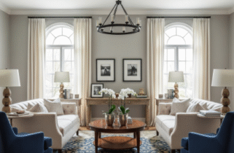
Symmetry is the default for a reason—it’s visually calming, it signals order, and it’s hard to mess up. You put matching candlesticks on either side, maybe a mirror or a piece of art in the center, and you’re done. I used to stage every fireplace this way because it felt foolproof. But then I noticed that the homes with slightly asymmetrical mantels—where you’d have a tall vase on one side, a stack of books on the other, and maybe a leaning piece of abstract art—those were the ones getting shared on social media and recieving offers faster, sometimes within days. Asymmetry introduces tension, and tension, weirdly enough, makes people lean in. It feels curated rather than staged, like someone actually lives there and has taste. The trick is keeping the visual weight balanced even if the objects themselves aren’t mirrored—so if you have something tall and narrow on the left, you might balance it with something low and wide on the right. It’s intuitive once you start doing it, but it’s also easy to tip into chaos if you’re not careful.
I guess it makes sense that buyers respond to this kind of styling because it mirrors how we actually decorate our own homes—imperfectly, over time, with things we’ve collected. Wait—maybe that’s why it works.
Scaling Objects to the Fireplace Architecture Without Making It Look Like a Museum Display
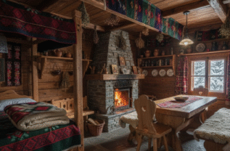
The biggest mistake I see is people using objects that are way too small for the mantel, so you end up with these tiny picture frames and tea lights that just disappear against a massive stone surround. Scale matters more than almost anything else here. If you have a grand, floor-to-ceiling fireplace with thick molding, you need substantial pieces—oversized mirrors, chunky candlesticks, maybe a large piece of driftwood or a sculptural vase that’s at least 18 inches tall. On the other hand, if it’s a modest brick fireplace in a cottage-style home, going too big will overwhelm the space and make it feel cluttered. I’ve learned to eyeball it by standing back about ten feet and squinting—if the objects on the mantel blend into the background, they’re too small; if they dominate the entire wall, they’re too large. You want them to feel proportional to the firebox opening, roughly speaking, though that’s not a hard rule.
Honestly, I’ve staged fireplaces where I removed everything except one large mirror and a single potted plant, and the effect was stunning. Less really can be more, especially in smaller rooms where buyers need to imagine their own stuff in the space.
Another thing: texture. You can’t just use smooth, glossy objects—you need contrast. Matte ceramics next to polished brass, rough wood next to soft linen, stone beside glass. This is where staging starts to feel a little like cooking, where you’re balancing flavors. I once staged a fireplace with a vintage wooden ladder leaning against the side, a ceramic jug, and three white pillar candles of varying heights, and the texture play alone made the room feel expensive. The ladder was from a flea market and cost maybe twenty bucks, give or take.
The mantel isn’t just decorative—it’s doing emotional work. It’s telling buyers that this home has character, that it’s been cared for, that it’s worth the asking price. And if you get it right, they’ll remember that fireplace long after they’ve forgotten the kitchen countertops.

