I used to think beige was the coward’s choice for home staging—until I watched three buyers compete over a supposedly ‘boring’ taupe-walled bungalow in Seattle.
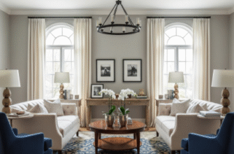
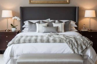
Turns out, the science behind neutral colors isn’t actually about playing it safe, though that’s what every staging manual from roughly the last two decades will tell you. It’s about how our brains process unfamiliar spaces under stress. When you’re touring a potential home, your cortisol levels spike slightly—not dramatically, but enough that your visual cortex starts filtering out complexity. Colors that require interpretation (is that mauve? dusty rose? greige?) create what researchers call ‘cognitive friction,’ and friction, in real estate, equals doubt. Soft whites, warm grays, and those nearly-colorless beiges work because they’re perceptually effortless. Your brain doesn’t have to decide what it thinks about them. They just… exist. Which sounds depressing until you realize that this neutrality is precisely what lets potential buyers project their own fantasies onto the space.
Here’s the thing, though: not all neutrals read as neutral to everyone. I’ve seen staging consultants confidently slap ‘Accessible Beige’ on every wall, only to have buyers from different cultural backgrounds describe the same room as either ‘warm and inviting’ or ‘oddly institutional.’ Context matters—a lot.
The Surprisingly Complicated Psychology of White (And Why Cool Tones Backfire More Often Than You’d Think)
Pure white walls sound like the safest bet, right?
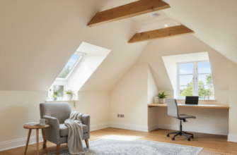
Except pure white doesn’t actually exist in most homes—at least not the way we percieve it. Lighting temperatures shift throughout the day, and what looks crisp at noon can read as stark or even bluish by 4 PM. Cool-toned whites and grays have this peculiar ability to make spaces feel larger, which is great, but they also tend to feel emotionally distant. There’s actually some fascinating research out of environmental psychology labs suggesting that cooler color temperatures subtly suppress the ‘nesting’ instinct—that primitive urge to imagine yourself cooking dinner or reading on the couch in a space. Warmer whites, the ones with just a whisper of cream or yellow, do the opposite. They don’t photograph quite as dramatically for listings, which frustrates photographers, but they make people linger during showings.
I guess it makes sense. We’re not logical creatures when we’re spending six figures.
Accent Colors That Work Without Making Anyone Uncomfortable (The Data on Blue is Legitimately Wild)
Wait—maybe I’m getting ahead of myself, but the numbers on blue are absurd. Multiple studies, including one from a UK property analytics firm that tracked something like 40,000 listings, found that homes with blue accents—specifically in kitchens or bathrooms—sold for roughly 1.6% more than equivalent homes without. That doesn’t sound like much until you do the math on a $500,000 house. We’re talking $8,000 for paint. The theory is that blue triggers associations with cleanliness and calm, but honestly, I think it’s just that blue is one of the few colors that doesn’t have strong polarizing reactions. Almost nobody hates blue. Sage greens work similarly, though they’ve gotten trendy enough recently that they might date a space faster than a safe navy or slate blue would.
Anyway, the key is restraint.
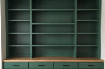
Accent walls are trickier than Instagram makes them seem. If you go bold—charcoal, deep green, even a moody terracotta—you’re banking on the buyer having taste that aligns with yours, and that’s a gamble. The safer play is using those colors in small, replaceable doses: throw pillows, artwork, maybe a painted door. Things that signal ‘this space has personality’ without committing to a specific personality that might repel half your audience.
The Unexpected Role of Undertones (And Why Your ‘Neutral’ Might Be Secretly Polarizing)
Here’s where it gets messy, and where even experienced stagers screw up occasionally.
Every neutral has an undertone—gray-beiges lean purple or green, whites lean yellow or blue, grays lean brown or violet. Most people can’t consciously identify undertones, but they definately feel them. I’ve watched buyers reject perfectly nice homes because the walls felt ‘off’ in a way they couldn’t articulate, and nine times out of ten, it’s clashing undertones. The beige has pink undertones, but the flooring has yellow ones, and the whole space just vibrates with visual dissonance. The fix is annoying but simple: test paint samples next to your existing finishes—flooring, countertops, trim—and photograph them in different lighting. If the undertones harmonize, the space will feel cohesive even if a buyer can’t explain why. If they clash, no amount of staging furniture will fix that subconscious unease.
When ‘Safer’ Color Choices Actually Reduce Appeal (And the Strange Case of All-White Kitchens)
This is going to sound contradictory, but bear with me: sometimes playing it too safe makes a space forgettable, which is almost worse than making it polarizing. All-white kitchens became ubiquitous around 2015, and for a while, they worked. They photographed beautifully, felt clean, signaled modernity. But by 2023, they’d become so expected that they stopped registering as a selling point. Worse, they started reading as incomplete—like a blank canvas waiting for the ‘real’ kitchen to be installed. Buyers would walk through and immediately start budgeting for updates, even though the kitchen was brand new. Adding just one contrasting element—black hardware, wood shelving, a patterned backsplash, even just gray lower cabinets—breaks that monotony without introducing real risk. It gives the eye somewhere to rest and, weirdly, makes the white feel intentional instead of default. I used to push back against this advice, figured white was white and buyers would appreciate the simplicity, but the showing feedback changed my mind pretty quickly. Personality, in microscopic doses, beats sterility almost every time.

