I used to think two-tone furniture was something only professional designers could pull off.
Turns out, the whole thing is less about precision and more about understanding how colors interact with each other in physical space—not just on a screen or in your head. I’ve spent way too many weekends standing in hardware stores, holding paint chips up to my phone’s camera roll, trying to figure out why a combination that looked stunning on Pinterest made my dresser look like it belonged in a preschool. The issue, I eventually realized, wasn’t the colors themselves but how light hits different surfaces, how much visual weight each tone carries, and honestly, whether you’re the kind of person who can live with a bold choice or if you’ll repaint it in three months. Some people can commit to navy and mustard. Others—myself included, sometimes—need the safety of greige and white. And that’s fine, I guess, though it does feel a bit like admitting defeat.
Here’s the thing: contrast matters more than coordination. If you pick two colors that are too close in value—say, a medium blue and a slightly darker blue—the piece ends up looking muddy from across the room. You want tonal separation, which is designer-speak for “make sure one color is clearly lighter or darker than the other.”
Why Navy Blue and Natural Wood Grain Still Dominates Every Design Blog You’ve Ever Seen
Navy has been the go-to sophisticated dark for maybe five years now, and it’s not going anywhere.
I’ve seen this combination on at least 400 dressers on Instagram, and yet it never quite feels overdone because wood grain itself is so variable—oak doesn’t look like walnut, pine doesn’t look like cherry, and the navy reads differently against each one. The trick is leaving the top surface or drawer fronts in raw or stained wood while painting the body navy, which creates this anchoring effect that makes even a cheap IKEA piece feel deliberately curated. You can also reverse it—paint the drawers navy and leave the frame wood—but that tends to feel busier, more cottage-y, less midcentury. Wait—maybe that’s the point, depending on what you’re going for. I used to default to painting everything, but leaving some wood exposed saves time and adds textural complexity you can’t replicate with paint alone.
The Unexpected Elegance of Sage Green Paired With Off-White or Cream Tones
Sage green had a moment around 2021, got overused in nurseries and “calming spaces,” and now it’s back but more muted.
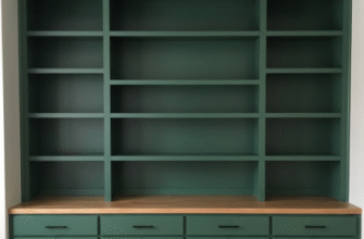
The version that works for furniture is less mint, more gray-green, almost like eucalyptus leaves after they’ve dried out a bit. When you pair it with off-white—not stark white, which makes the green look sickly, but something with a warm undertone like cream or ivory—you get this soft, almost European countryside vibe without tipping into shabby chic territory. I painted a bedside table this combination last year and was genuinely surprised by how much it elevated the whole room, even though the table itself cost maybe thirty dollars at a thrift store. The key is using the darker color (sage) on the larger surfaces and the lighter color (cream) on details like drawer interiors, legs, or trim. Flip that ratio and it starts looking washed out.
Charcoal Gray and Blush Pink for People Who Want Edge Without Committing to Black
This one feels risky until you actually see it in person.
Charcoal—not true black, but that deep gray that’s almost black—gives you all the drama of a dark base without the harshness that black can bring, especially in smaller rooms or on smaller furniture pieces. Blush pink, when it’s not too bubblegum, acts as this surprisingly mature accent that softens the gray without making it feel feminine in a stereotypical way. I guess it helps that blush has enough brown in it to feel earthy rather than candy-colored. I’ve used this on a desk where the body was charcoal and the drawer fronts were blush, and people always assume it’s vintage or custom. The contrast is strong enough to be interesting but not so stark that it screams for attention, which is probably why it photographs well but also actually lives well in a space.
Mustard Yellow and Teal Blue When You’re Tired of Playing It Safe
Honestly, this combination is not for everyone, and I say that as someone who painted a chair this way and then immediatley regretted it for two weeks before deciding I loved it.
Mustard and teal are both saturated, both warm-leaning (yes, even teal, which has enough green to pull it away from pure cool blue), and both have strong personalities. The result is vibrant, a little retro, definitely not neutral, and it will make or break a room depending on what else you have going on. If your space is mostly neutral, this kind of piece becomes the focal point—which is great if that’s what you want, exhausting if it’s not. I’ve found that using mustard as the smaller accent color and teal as the dominant tone works better than the reverse, probably because teal recedes visually while mustard advances. But maybe that’s just my bias talking, since I tend to favor cooler palettes anyway.
Soft White Combined With Any Muted Earth Tone for Maximum Versatility and Resale Value
If you’re painting furniture you might want to sell later, or if you just can’t decide, this is the safe bet that still feels intentional.
Soft white—again, not stark, not cool-toned, but something with a hint of warmth—pairs with basically any earth tone: terracotta, rust, olive, taupe, clay, sand, you name it. The white keeps it feeling fresh and not too heavy, while the earth tone grounds it and keeps it from looking too sterile or Scandinavian-minimal (unless that’s your goal, in which case, go for it). I painted a bookshelf white with terracotta-painted interiors, and it’s the one piece I’ve never second-guessed. The color shows up when the shelves are empty but doesn’t compete with books or objects when they’re full. It’s also forgiving—if you mess up a brushstroke or the coverage isn’t perfect, the contrast is gentle enough that imperfections read as character rather than mistakes, which is definately a relief when you’re doing this in your living room with a toddler running around.


