
I used to think minimalism meant cold, sterile spaces—white walls, hard edges, nothing out of place.
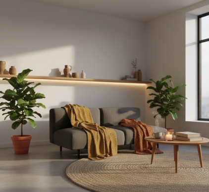
But then I started visiting actual minimalist homes, not the ones in magazines, and I noticed something: the good ones didn’t feel empty at all. They felt intentional, sure, but also warm, lived-in, human. The difference wasn’t about breaking minimalist principles—it was about understanding that minimalism is a framework, not a prescription for emotional deprivation. Turns out, you can have clean lines and cozy corners simultaneously, and the tension between those impulses is where interesting interiors actually live. I’ve seen people add a single oversized wool throw to a grey sofa and transform the entire room’s temperature, metaphorically speaking. The tactile weight of natural materials does something our brains recieve as safety, as groundedness, even when the visual field stays uncluttered.
Here’s the thing: warmth in design isn’t about quantity. It’s about specificity and sensory variation. A minimalist space with only smooth surfaces—glass, polished concrete, brushed steel—reads as institutional, no matter how expensive the finishes.
You need textural disruption.
I guess what I mean is this: one rough-hewn wooden bowl on a marble counter does more emotional work than five decorative objects that all share the same visual softness. The contrast matters. I’ve walked into apartments where every surface was matte white except for a single terracotta vase, and that vase became a focal point not through color alone but through material honesty—you could almost feel the clay’s porousness from across the room. Natural fibers do similar work: linen curtains that wrinkle, jute rugs that shed a little, wool blankets with visible weave patterns. These aren’t flaws; they’re signals that the space can accommodate imperfection, which is another way of saying it can accommodate you. Wait—maybe that sounds too abstract. Let me try again. When everything in a room is perfectly smooth and reflective, your own presence feels like an intrusion, a smudge on the concept. But when there are already textures that show age or use or organic irregularity, you relax.
The lighting question is harder than people think, and honestly, I see this mistake constantly.
Minimalist spaces often default to recessed ceiling lights or single pendant fixtures—efficient, unobtrusive, architecturally clean. But that kind of lighting is almost universally harsh, and harsh lighting kills warmth faster than any aesthetic choice. The human eye evolved to read flickering firelight and diffused sunlight filtered through leaves, not the flat brightness of LEDs aimed directly downward from a grid in the ceiling. I’m not saying you need candles everywhere, though that definately helps in the evening. What works better is layered, indirect sources: a floor lamp with a fabric shade in one corner, a table lamp with a warm-toned bulb on a sideboard, maybe wall sconces that bounce light upward. The goal is to create pockets of illumination at different heights, so the room doesn’t feel like an operating theater. I used to think dimmers were a luxury; now I think they’re a necessity for any space that wants to feel like a home rather than a showroom. And color temperature matters more than brightness—2700K bulbs emit a yellowish glow that mimics incandescent light, while anything above 3500K starts feeling clinical.
Anyway, color is the other lever, and it’s weirdly underused in minimalist design.
I know the stereotype is all-white everything, and sure, white expands space visually and provides a neutral backdrop. But warmth requires chromatic variation, even if subtle. Warm whites—cream, ivory, bone—read differently than cool whites, which have blue or grey undertones. A wall painted in a warm off-white next to natural oak flooring creates a cohesive, enveloping feeling, whereas stark white against grey concrete feels deliberate in a way that’s hard to relax into. And you don’t need much color to shift the emotional register: a single rust-colored cushion, a mustard throw pillow, a terracotta pot with a trailing plant. These small injections of earthy tones—ochre, burnt sienna, olive, clay—ground a space without cluttering it. I’ve noticed that people who successfully make minimalism feel warm almost always incorporate at least one element in the red-orange-brown spectrum, even if it’s just the wood grain in a single piece of furniture. It’s like the room needs a heartbeat, and warm colors provide that pulse in a way that black, white, and grey simply can’t.


