I used to think color was just about picking something you liked and slapping it on the walls.
Then I moved into a house where every room felt like a different planet—the kitchen was this aggressive teal, the hallway a beige so lifeless it made me want to take a nap, and the living room had this burgundy accent wall that seemed to scream at you when you walked in. It wasn’t until I started noticing how exhausting it felt to move through the space that I realized something: color doesn’t just sit there looking pretty. It moves with you, or it fights you. And when you’ve got a bunch of rooms that don’t talk to each other, even gorgeous individual spaces can feel like they’re having separate arguments. The thing is, creating flow isn’t about making everything matchy-matchy—it’s about building a visual conversation that doesn’t require you to recalibrate your brain every time you cross a threshold.
Turns out, there’s this whole psychology behind why some homes feel cohesive and others feel like a patchwork quilt made by committee. I started digging into it after a friend who’s an interior designer casually mentioned that the human eye craves continuity, even if it doesn’t consciously register it. She said something like, “Your brain is doing math every time you walk through a doorway,” which sounded ridiculous until I thought about it.
Anyway, here’s the thing about creating flow: it’s less about rules and more about understanding how your eye travels through space.
The Surprisingly Emotional Business of Color Relationships Across Doorways
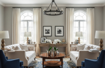
Color relationships work kind of like musical notes—some combinations harmonize, others clash, and a few create this weird tension that can actually be interesting if you’re into that sort of thing. I’ve seen homes where designers used analogous colors (colors that sit next to each other on the color wheel, give or take) to create this seamless drift from one room to another. Like, a soft sage green in the bedroom bleeding into a muted blue-green in the hallway, then shifting to a dusty blue in the bathroom. Your eye doesn’t have to work hard because the transition feels almost inevitable, like watching a sunset where you can’t pinpoint exactly when orange became pink.
But honestly? Sometimes the most effective flow comes from repetition rather than gradation.
I remember walking through this old Victorian where the owner had used the same warm cream on every wall but changed the accent colors room by room—burnt orange in the dining room, deep plum in the study, forest green in the bedroom. It shouldn’t have worked, but it did, because that neutral backbone gave your brain something consistent to anchor to. The designer told me she’d pulled all the accent colors from a single vintage rug in the entryway, which felt almost embarrassingly simple but definately effective. Wait—maybe that’s the secret nobody wants to admit: flow doesn’t require complexity. It requires commitment to a throughline, even if that throughline is just “we’re using variations of gray and letting texture do the talking.”
Architectural Elements That Either Save Your Color Scheme or Sabotage It Completely
Here’s where it gets messy: your house has opinions.
Trim color is one of those things that sounds boring until you realize it’s basically the frame around every color decision you make. White trim can make colors pop and create clean separations between rooms, which works great if you want distinct spaces that still feel connected by that crisp architectural detail. But if you’re going for something more fluid, painting your trim the same color as your walls (or close to it) erases those hard boundaries and lets the space breathe differently. I’ve walked through homes where they painted all the trim a soft charcoal and suddenly the whole place felt like it was designed by one coherent brain instead of assembled over decades of random paint store trips.
Flooring does similar work, though people seem to forget about it until they’ve already committed to seventeen different wall colors. Continuous flooring—same wood, same tile, same whatever—creates an automatic sense of flow that’s almost impossible to screw up. I guess it makes sense: if the ground beneath you stays consistent, your brain worries less about the walls changing color.
The Weird Science of Sightlines and How They Expose Every Color Mistake You’ve Ever Made
Stand in your hallway and look at every doorway you can see from that spot.
What you’re looking at is called a sightline, and it’s basically a preview of every room visible from where you’re standing. If those rooms are wildly different colors with no relationship to each other—say, a bright yellow kitchen, a gray bedroom, and a terracotta bathroom all visible at once—your eye does this uncomfortable pinball thing where it can’t figure out where to rest. Designers obsess over sightlines because they reveal the truth about whether your color scheme actually works or just looks okay when you’re standing inside each individual room with the door closed.
I’ve seen people solve this by using a dominant color that appears in every sightline, even if it’s just through artwork or textiles. Like, if every room visible from your main hallway has at least some blue in it—even if one room is mostly beige and another is mostly green—your brain picks up on that repetition and relaxes slightly. It’s not foolproof, honestly, because sometimes the proportions are off and you end up with what looks like someone just bought a bunch of blue throw pillows and called it interior design.
Lighting Conditions That Make Your Carefully Planned Color Flow Look Completely Different Than You Expected
Natural light is a liar.
I learned this the hard way when I painted a room what I thought was a beautiful warm gray, only to discover it turned lavender in morning light, green at noon, and vaguely depressing by 4 PM. Color looks different depending on which direction your windows face, how much light comes in, what time of day it is, and apparently what the weather feels like doing. North-facing rooms get cooler, bluer light that can make warm colors look muddy and cool colors look icy. South-facing rooms (in the Northern Hemisphere, anyway—roughly speaking) get warmer, more consistent light that’s more forgiving but can also make some colors look washed out.
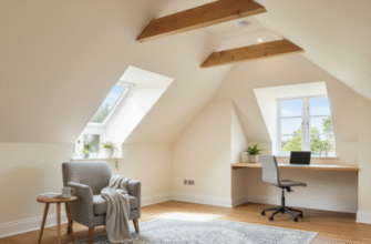
This matters for flow because a color that looks perfect in your bright, south-facing living room might look completely different when it continues into a darker hallway. I’ve walked through homes where the designer clearly tested paint samples in every room at different times of day, because the transitions actually worked despite the varying light conditions. Others felt like they’d picked colors from a fan deck under fluorescent store lighting and just hoped for the best.
Artificial lighting does its own weird thing—incandescent bulbs add warmth, LEDs can go either way depending on their color temperature, and fluorescents make everything look like a hospital or a really depressing office building. If you’re trying to create flow, you need consistent lighting temperatures throughout the spaces you want to feel connected, otherwise your carefully chosen color palette will betray you every time you turn on a lamp.

