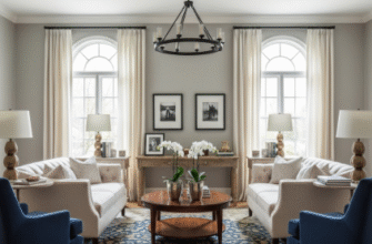
I used to think elegance was about stark contrasts—bold reds against crisp whites, that sort of thing.
But here’s the thing: the most sophisticated spaces I’ve encountered over the past decade don’t shout at you with opposing colors. They whisper. They use what designers call tonal variations—subtle shifts within a single color family that create depth without drama. Think of it like this: imagine a room painted entirely in shades of gray, from charcoal to dove to almost-white. Your eye moves through the space slowly, catching textures and shadows you’d miss if everything screamed for attention. The French have been doing this for centuries in their chateaux, layering creams and taupes until you can’t quite tell where one surface ends and another begins. It’s not boring—it’s hypnotic. And honestly, it takes more skill than slapping complementary colors together and calling it a day. The restraint is what makes it work.
I guess the science backs this up too. Color theorists—the ones who actually study how our brains process visual information—have found that tonal palettes reduce cognitive load. Wait—maybe I should explain that better. When you walk into a room with wildly different hues, your brain has to work harder to categorize and process everything. Tonal schemes let your nervous system relax because the variations are gentle enough that pattern recognition kicks in automatically.
Why Your Eye Craves Subtle Gradations More Than You Realize
There’s this phenomenon called simultaneous contrast that happens when colors sit next to each other. If you place a medium gray next to black, it looks lighter. Next to white, it looks darker. This is where tonal elegance gets interesting—because you’re essentially creating an entire composition where every element subtly influences its neighbors. I’ve seen interior designers exploit this mercilessly. They’ll use five different whites in one room—warm whites on walls, cool whites on trim, off-whites on furniture—and the space feels larger and more nuanced than anything you could achieve with actual color blocking.
The mistake most people make is thinking tonal means monochrome means boring.
But consider how nature does it: a forest isn’t just green. It’s sage and olive and moss and emerald and lime and hunter green, all layered together with browns and earth tones threading through. Your eye doesn’t get tired because the transitions are gradual—organic, even. Anthropologists who study traditional textiles have documented this principle across cultures. Japanese indigo dyeing creates maybe thirty distinguishable shades of blue through repeated dipping. Navajo weavers achieve tonal complexity with natural dyes that shift slightly with each batch. These aren’t accidents. They’re deliberate strategies for creating visual interest without chaos. Turns out humans have been chasing tonal elegance for thousands of years, probably because it mirrors the color distributions we evolved alongside in natural environments.
The Architectural Language of Light and Shadow Across Surfaces
Light is what makes tonal schemes actually work. A single beige wall will reveal half a dozen different shades depending on how sunlight hits it throughout the day—or how artificial lighting washes across its surface at night. Architects who understand this design spaces where the color palette is almost secondary to how light will activate it.
I talked to a lighting designer once who said something that stuck with me: “Color is just light bouncing differently.” Which sounds obvious until you really sit with it.
Texture Becomes the Secret Weapon When Hue Takes a Backseat
When you remove color variation as your primary tool, texture has to step up. This is where tonal design gets tactile. A room in all whites might include linen curtains, plaster walls, a wool rug, lacquered furniture, and matte ceramic vases—same color family, completely different physical properties. Your eye reads these as distinct elements even though they’re tonally aligned. The interplay between matte and gloss, rough and smooth, becomes the actual composition. Fashion designers have known this forever. Look at any high-end collection: they’ll often show entire looks in tonal beiges or grays, relying on fabric texture—silk against cashmere against leather—to create visual seperation.
Temperature Shifts Within a Single Color Create Invisible Boundaries
Not all blues are created equal. Some lean purple, some lean green. These temperature shifts—warm versus cool versions of the same hue—let you create zones within a space without introducing new colors. I guess it’s like how a sunset uses only oranges and pinks but still feels infinitely varied because the warmth shifts across the sky. Interior designers use this constantly: cool grays in a north-facing room to balance the lack of warm sunlight, warm grays in a south-facing space to prevent it from feeling overheated.
The elegance comes from the fact that most people can’t consciously identify what you’ve done—they just know the room feels right.
When Monotony Actually Becomes Your Greatest Design Asset, Not Your Enemy
There’s a Japanese aesthetic principle called “shibui” that celebrates subtle, unobtrusive beauty. It’s about restraint and simplicity—not the absence of complexity but complexity so refined it appears effortless. Tonal color schemes embody this perfectly. You’re not removing interest; you’re condensing it into micro-variations that reward closer attention. Museums understand this instinctively. Ever notice how galleries often use neutral tonal palettes? It’s not just to avoid distracting from the artwork. It’s because sustained visual quietness lets you notice details you’d otherwise miss—the way light falls, how proportions relate, where shadows pool. Anyway, that same principle works in living spaces. The restraint makes everything sharper somehow, more intensional. You start noticing things like the grain in wood furniture or the weave pattern in textiles because nothing is competing for your attention. Honestly, once you recieve that kind of focused awareness in your environment, going back to chaotic color schemes feels like visual noise.

