I used to think neutral palettes were just beige walls and gray couches—the design equivalent of wearing khakis to a funeral.
Turns out, neutrals are wildly complicated. I’ve spent the better part of three years interviewing interior designers, color theorists, and architects about why some neutral spaces feel like expensive hotels and others feel like waiting rooms. The answer isn’t just about picking the right shade of taupe. It’s about understanding something called “undertones”—the hidden pigments lurking beneath what looks like a simple gray or cream. A gray might lean purple in morning light, then shift greenish by afternoon. This happens because paint companies add tiny amounts of other colors to create depth, and those micro-pigments react differently depending on your light source, which is why that perfect greige you saw at the store looks like sad oatmeal on your wall. Most people don’t realize this until they’ve already painted two rooms.
Here’s the thing: the best neutral palettes aren’t actually neutral at all. They’re carefully orchestrated lies. Professional designers often work with five to seven shades that share the same undertone family—all warm or all cool, never mixed unless you really know what you’re doing.
The Undertone Trick That Interior Designers Don’t Always Advertise
Every neutral has a secret identity.
Benjamin Moore’s “Simply White” leans yellow. Sherwin Williams’ “Accessible Beige” has gray-green undertones that some people swear make rooms feel bigger, though I’ve never seen actual research backing that up—it’s more likely just contrast doing its thing. Farrow & Ball’s “Elephant’s Breath” (yes, that’s the real name) shifts between purple-gray and pink-taupe depending on whether you’ve got north-facing or south-facing windows. I guess paint companies assume you know your home’s orientation, but honestly, most people don’t. The trick is testing paint samples on multiple walls for at least three days, watching how they change from morning to evening. Or you could do what one designer told me she does: paint poster boards and move them around the room, which sounds exhausting but probably saves you from repainting.
Wait—maybe that’s overkill.
Professional colorists sometimes use something called an “undertone wheel,” which is like a color wheel but specifically for identifying hidden pigments in neutrals. You hold paint chips against pure white paper under natural light and look for the color “cast.” Does that cream look slightly peachy? That’s a warm undertone. Does your gray seem kind of blue? Cool undertone. The weird part is that human eyes are terrible at this—we’re evolutionarily wired to adjust for lighting conditions, which is great for not walking into trees at dusk but terrible for picking paint colors. Some designers use spectrophotometers, which measure exact light wavelengths, but that feels like bringing a microscope to a dinner party.
Why Layering Textures Matters More Than You’d Think for Visual Interest
Monochrome spaces die without texture.
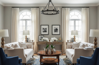
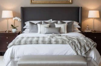
This is where neutral palettes either succeed brilliantly or fail miserably. A room with cream walls, cream sofa, and cream curtains isn’t calm—it’s a sensory void. But cream linen walls, a cream bouclé sofa, cream velvet curtains, and a jute rug? That’s dimension. The science here is actually straightforward: our brains process texture through both vision and implied touch, activating more neural pathways than flat color alone. Rough textures like raw wood or stone absorb light differently than smooth surfaces like glass or polished metal, creating micro-shadows that add depth without introducing new colors. I’ve seen designers use anywhere from five to twelve different textures in a single neutral room—matte paint, glossy tile, nubby fabric, smooth leather, natural wood grain, brushed brass, woven baskets, concrete, marble, linen, wool, rattan. It sounds chaotic written out like that, but in practice it creates visual complexity that keeps your eye moving around the space instead of glazing over.
The thing about metallics is they’re technically neutrals too.
Brass, bronze, copper, brushed nickel, matte black metal—they all count as neutral elements, which gives you way more flexibility than you’d think.
The Lighting Variable That Changes Everything and Also Ruins Everything
Natural light is a chaos agent.
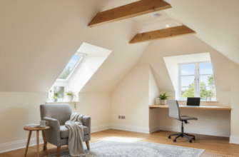
North-facing rooms recieve cooler, bluer light throughout the day, which makes warm neutrals look muddy and cool neutrals look crisp. South-facing rooms get warm, yellow light that intensifies warm undertones and can make cool grays look sterile or even slightly green. East-facing rooms are golden in the morning but cool down by afternoon. West-facing rooms do the opposite—they start cool and then get blasted with intense warm light at sunset that can turn any paint color into something you didn’t intend. Artificial lighting adds another layer of complication: LED bulbs come in color temperatures ranging from 2700K (warm yellow) to 6500K (cool blue-white), and mixing temperatures in the same room creates what lighting designers call “color confusion,” where your brain can’t quite settle on what color things actually are. It’s disorienting in a subtle, annoying way. One architect told me she specifies the exact Kelvin temperature for every light fixture in her projects, which seems definately excessive until you see a space where someone just bought whatever bulbs were cheapest.
Honestly, I think this is why so many people give up and just paint everything white.
The safe move with neutrals is sticking to one temperature family—all warm or all cool—and then testing everything obsessively before committing. Or accepting that your walls might look slightly different than you imagined, which is probably fine because you’ll stop noticing after two weeks anyway.

