I used to think Colombian interior design was just about throwing bright colors on walls and calling it a day.
Turns out, the whole thing is way more complicated than that—and honestly, more interesting. When I first started looking into how Colombian designers work with color, I expected to find some neat historical explanation about Spanish colonial influence or maybe something about indigenous traditions. Instead, I found myself down a rabbit hole about how tropical light actually changes the way pigments look on surfaces, and how designers in cities like Cartagena and Medellín have been quietly developing color theories that would make a European minimalist’s head spin. The saturation levels they use—we’re talking jewel tones that would feel aggressive in a London flat—somehow read as balanced when you’re dealing with that intense equatorial sunlight streaming through windows. It’s not just aesthetic preference; it’s physics meeting culture, and the result is spaces that feel alive in a way I definately wasn’t expecting. The designers I spoke with kept using words like “energy” and “movement,” which initially sounded like design-speak, but after seeing enough photos of actual Colombian homes, I started to get it.
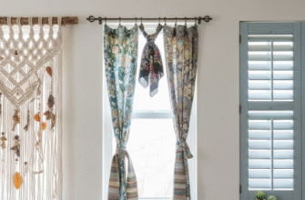
Here’s the thing about those tropical patterns everyone associates with Colombian interiors: they’re not random. The palm fronds, the oversized florals, the geometric patterns that reference both pre-Columbian textiles and Portuguese tiles—they all serve a purpose beyond decoration. In humid climates, busy patterns actually help disguise the wear and weathering that happens faster than in temperate zones.
When Traditional Craft Techniques Meet Contemporary Color Psychology
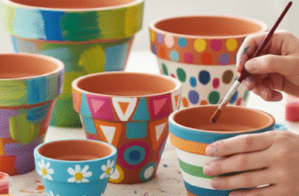
The woven textiles from regions like Guajira and the ceramic work from Ráquira aren’t just folk art that designers throw into modern spaces for “authenticity.” These craft traditions carry specific color combinations that have been refined over generations—combinations that, wait—maybe this sounds too romantic, but they genuinely seem to affect mood differently than the color palettes I’m used to seeing in North American design magazines. Anthropologists have documented how certain indigenous Colombian communities used natural dyes in ways that created colors with subtly different undertones than synthetic versions, and contemporary designers are now reverse-engineering those recipes. One designer in Bogotá told me she spent six months working with a natural dye specialist to recreate a specific shade of indigo that appears in 19th-century textiles, not because synthetic indigo doesn’t exist, but because the natural version has this slightly irregular quality that changes depending on the light—which, in a tropical environment with rapidly shifting weather, creates this living quality in the space.
I guess it makes sense that a country with something like 311 types of ecosystems (give or take, depending on how you count) would develop regional design variations. Coastal interiors in Cartagena lean heavily into blues and whites with those patterns I mentioned earlier, while highland spaces in cities like Manizales use warmer terracottas and deep greens that reference coffee plantations and cloud forests. The practical considerations are obvious—coastal humidity versus highland coolness—but designers also told me about less obvious factors, like how altitude affects color perception, which apparently is a real thing that interior designers in Colombia have to account for.
The Unexpected Influence of Twentieth-Century Colombian Architecture on Color Use
Rogelio Salmona, who died in 2007, might be the most important figure nobody talks about when discussing Colombian interior color palettes. His architecture—all those red brick structures with geometric patterns and water features in Bogotá—basically created a vocabulary for how Colombians think about integrating color into living spaces. The way he used brick as both structure and decoration, letting the natural variations in clay create subtle color fields, that approach trickled down into how interior designers started thinking about texture and color as inseperable elements. You can see his influence in contemporary Colombian interiors that use raw materials—exposed concrete, unfinished wood, terracotta tiles—as color sources rather than just structural elements.
Honestly, the economic context matters here too. Colombia’s design boom has been happening alongside major urban development and a growing middle class over the past two decades, which means designers have been working with clients who want spaces that feel distinctly Colombian but also contemporary and functional. That’s created this interesting pressure to evolve traditional aesthetics rather than just preserve them.
How Tropical Plants Function as Both Pattern and Living Color Elements
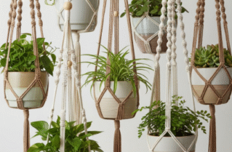
The indoor plant situation in Colombian homes operates on a different scale than what I’m used to seeing elsewhere. We’re not talking about a fiddle-leaf fig in the corner—we’re talking about interior courtyards, living walls that cover entire surfaces, hanging plants that create layers of green at different heights throughout a room. One interior designer in Medellín told me she considers plants the primary color element in her projects, with painted surfaces and furniture as secondary. That seemed extreme until I saw photos of her work, where the various shades of green—from deep emerald to lime to olive—created more visual interest than any paint selection could achieve. The patterns of the leaves, the way they cast shadows, the fact that they’re literally changing and growing, it all feeds into that sense of movement and energy that seems central to Colombian design philosophy. Plants also help with the humidity and air quality issues that come with tropical climates, so they’re functional in ways beyond aesthetics, which maybe explains why they’re so integrated into the design vocabulary rather than treated as optional decorative elements.
Why Colombian Design Principles Might Actually Be More Relevant Now Than European Minimalism
Look, I’m not trying to make some grand argument about cultural superiority in design—that would be exhausting and probably wrong—but there’s something worth noting about how Colombian approaches to color and pattern might actually be better suited to our current moment than the Scandinavian minimalism that’s dominated for the past decade. As climate change makes more places experience tropical or subtropical conditions, and as people spend more time in their homes (thanks, pandemic), design principles developed for hot, humid environments where indoor and outdoor spaces blur together start making more practical sense. The high-contrast colors that Colombian designers use help define spaces in open floor plans without physical walls. The emphasis on natural materials that age gracefully matters more when supply chain issues make frequent renovations impractical. The integration of living plants addresses air quality concerns that have become more prominent.
I’ve seen enough design trends cycle through to be skeptical of anything being labeled as “the next big thing,” but Colombian interior design isn’t trying to be the next big thing—it’s been evolving regionally for decades, and the rest of the world is just now paying attention.

