I used to think the whole “blue calms you down” thing was pseudoscience, honestly.
Then I painted my bedroom a shade of slate blue—not even a particularly soothing shade, just something I found on sale—and within a week I was sleeping better. Coincidence? Maybe. But the research on color psychology in interior spaces suggests something more systematic is happening. Environmental psychologists have been studying this stuff since the 1970s, documenting how different wavelengths of visible light interact with our autonomic nervous system in ways we barely notice consciously. The mechanism isn’t fully understood, but studies from the University of Texas at Austin found that people in blue-hued rooms reported lower heart rates and reduced cortisol levels compared to those in red or yellow spaces. Not dramatically lower—we’re talking maybe a 5-7% difference—but enough to be statistically significant across hundreds of participants. Here’s the thing: the effect seems to compound over time, which is why you don’t necessarily feel it immediately when you walk into a freshly painted room.
Why Red Kitchens Might Actually Be Making You Hungrier (Or Just Annoyed)
Red stimulates appetite, which is why every fast-food chain uses it in their branding. But in a home kitchen? The results are messier. I’ve seen people swear their terracotta-red kitchen makes family dinners more lively, while others complain it makes them feel like they’re eating in a perpetual state of urgency. Turns out, the research is equally contradictory—some studies show red increases food consumption by roughly 20-30%, while others find no effect at all, or even the opposite. Cultural factors play a huge role here; in China, red signifies luck and celebration, so the psychological associations are totally different.
The Beige Trap and What Neutral Colors Actually Do to Your Brain
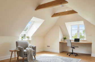
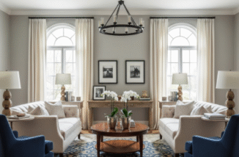
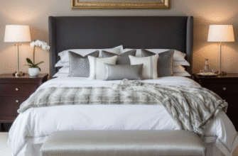
Neutrals—beige, gray, soft whites—dominate modern interior design, partly because they photograph well for Instagram, partly because we’ve been told they’re “timeless.”
But neutrals can backfire. A 2019 study from the Journal of Environmental Psychology found that participants in entirely neutral rooms reported feeling emotionally flatter, almost numb, compared to those in spaces with deliberate color accents. The researchers used the term “chromatic deprivation,” which sounds dramatic but tracks with what I’ve observed: people in relentlessly beige apartments often describe feeling uninspired or vaguely depressed without quite knowing why. The solution isn’t to paint everything neon orange—just introducing one accent wall in a saturated color, or even swapping out neutral textiles for jewel tones, seems to restore some emotional variability. Wait—maybe that’s why the Scandinavian design movement always includes those pops of mustard yellow or deep green? They understood something about sensory balance that the all-gray minimalism trend definately missed.
Green Spaces Indoors and the Evolutionary Hangover We Can’t Shake
Green is weird.
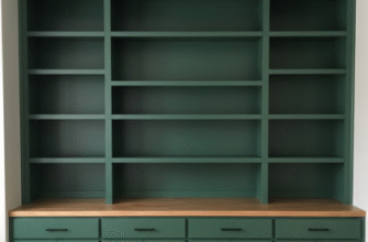
It’s the one color that almost universally tests well in interior psychology studies, regardless of culture or personal preference. Evolutionary psychologists argue this makes sense—our ancestors spent millenia in environments where green signaled water, food, safety. So when we paint a room sage green or fill it with plants, we’re essentially hacking an ancient neural pathway that says “you’re in a good place, relax.” The effect is subtle but measurable: one Dutch study tracked office workers who had green elements in their workspace versus those who didn’t, and found the green-group reported 15% less eye strain and fatigue over a six-month period. Anyway, I guess it makes sense that the color most associated with literal life would make us feel more alive indoors. Though I’ll admit, I once painted a bathroom a shade of lime green that was so aggressive it felt more like being inside a highlighter than a forest—so there are limits.
The practical takeaway? Color isn’t magic, but it’s not nothing either. If you’re going to spend 60-70% of your life indoors, you might as well make the wavelengths work for you instead of against you.

