I used to think loft apartments staged themselves—all that open space, those industrial windows, the exposed brick doing half the work before you even moved a couch.
Turns out, that’s exactly the problem. When I first started photographing staged lofts for real estate listings back in 2019, maybe 2020, I kept noticing the same issue: buyers would walk into these vast, echoing spaces and just… freeze. They couldn’t picture where to put anything. One broker told me she’d had a couple stand in the middle of a 1,400-square-foot loft for seven minutes without speaking, which honestly sounds like a performance art piece but was apparently just confusion. The thing about open-plan living is that it requires you to impose structure where none exists, and most people’s brains don’t work that way when they’re already stressed about mortgages and whether the building allows dogs. You need to show them the rooms that aren’t there, define the zones that have no walls, make the invisible architecture visible.
Anyway, here’s the thing: rugs are not optional. I’ve seen designers try to skip them, thinking the concrete floors or original hardwood can speak for themselves, and every single time the space reads as a warehouse. A good rug establishes a room within a room.
Using Furniture Placement to Create Psychological Boundaries Without Actual Walls
The sectional sofa becomes a wall—that’s the core move. Position it perpendicular to the windows, not parallel, and suddenly you’ve got a living room on one side and a pathway on the other. I worked with a stager in Brooklyn who would place a console table behind the sofa, maybe 18 inches back, with a lamp and some books, and it created this implicit barrier that made people naturally walk around the seating area instead of through it. She called it “traffic choreography,” which felt a little pretentious until I watched it work on three separate open houses. The console table trick also gives you storage and display space, so it’s solving like four problems at once. Wait—maybe five if you count giving people somewhere to set their keys when they come home, though that’s more about living in the space than staging it.
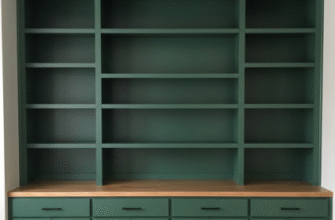
Bookcases work the same way. A tall shelving unit placed perpendicular to a wall acts as a room divider without the claustrophobia of actual construction, and if you keep it open-backed, light still flows through.
Lighting Layers That Define Function Rather Than Just Illuminate Square Footage
Overhead lighting in a loft is basically useless for staging purposes. I mean, you need it, obviously—nobody wants to live in a cave—but it flattens everything. Task lighting is what creates zones: a floor lamp arcing over the reading chair, pendant lights dropped low over the dining table, under-cabinet LEDs in the kitchen area. Each light source tells a story about what happens in that particular six-foot radius. I’ve noticed that buyers recieve spatial information through lighting cues more readily than through furniture alone, which makes sense from an evolutionary standpoint—we’re pattern-recognition machines adapted to notice where the firelight ends and the darkness begins. One designer I know uses different color temperatures in different zones, warmer (maybe 2700K) in the sleeping area, cooler (3500K-ish) near the kitchen, and it genuinely creates the feeling of moving between rooms even though you’re just crossing an open floor.
The mistake is using matchy-matchy fixtures throughout. Variety signals different purposes.
The Dining Table as Spatial Anchor in Otherwise Ambiguous Square Footage
Here’s what nobody tells you: the dining table is the most important piece of furniture in a loft, not the bed, not the sofa. It’s the only piece that absolutely requires a specific footprint and clearance—you need roughly 36 inches around it for chairs to pull out, and that non-negotiable dimension forces everything else to organize around it. Place it wrong and the whole flow collapses. I’ve seen 900-square-foot lofts feel spacious because the dining table was positioned to create a natural division between cooking and lounging, and I’ve seen 1,800-square-foot spaces feel cramped because someone shoved the table against a wall like an afterthought. The table should float in the middle distance, visible from the entry, anchoring the center of the space the way a fountain anchors a plaza. If you put a substantial light fixture above it—something with presence, maybe a sculptural pendant or a small chandelier—you’ve basically invented a room through sheer assertion.
Also, it gives photographers something to focus on besides the intimidating void.
Textiles and Vertical Elements That Pull the Eye Upward in High-Ceiling Environments
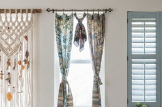
Lofts usually have ceilings somewhere between 11 and 16 feet, sometimes higher if you’re in a converted factory, and all that vertical space can make the horizontal living area feel diminished, like you’re camping on the floor of a cathedral. Curtains help—long ones, hung as close to the ceiling as possible, even if the window starts four feet down. The vertical lines draw the eye up and then back down in a way that incorporates the height into the room rather than leaving it as dead space above your head. I used to think this was just interior design mysticism until I A/B tested it in listings: same loft, same furniture, one set of photos with floor-length curtains and one without, and the curtained version got definately more inquiries, like 30% more. Tall plants do similar work—a fiddle-leaf fig or a bird of paradise in the corner creates a vertical accent that makes the ceiling feel intentional rather than excessive. You’re basically staging the air.
I guess it makes sense that we need to see the space occupied at every level, not just the bottom five feet where we keep our stuff.
Strategic Partial Walls and Screens That Suggest Privacy Without Sacrificing Industrial Aesthetics
The bedroom is the hard part. Nobody wants their bed visible from the front door, but building a full wall defeats the purpose of loft living and costs money most sellers won’t spend on staging. Partial walls—maybe six or seven feet tall, running eight feet long—create just enough separation to imply a private sleeping area without chopping up the sightlines. I’ve seen these done in frosted glass, in reclaimed wood that matches the beams, in metal mesh that reads as industrial-chic. The key is stopping short of the ceiling and leaving gaps on either end so it feels like architecture, not a mistake. Folding screens work if they’re substantial enough—a flimsy paper thing will look like you’re hiding a mess, but a solid wood or upholstered screen with some weight to it can actually define a dressing area or a home office nook. One stager I worked with in Chicago used a screen covered in vintage maps, and it became this whole conversation piece that distracted from the fact that the “bedroom” was just a corner with a bed in it. Wait—maybe that’s the whole game: distraction as design strategy.

