I used to think Spanish Revival was just about terracotta tiles and arched doorways.
Turns out, the whole thing is way more complicated—and honestly, more interesting—than I gave it credit for. The style emerged in the early 20th century, roughly between 1915 and 1931, give or take, when American architects got obsessed with romanticizing Spain’s colonial past. They weren’t exactly being historically accurate, though. They mixed Moorish elements from Andalusia, Mexican hacienda vibes, and even some Renaissance Italian details, creating this sort of fantasy Mediterranean aesthetic that technically never existed in one place at one time. But here’s the thing: it worked. The homes felt warm, grounded, textured in ways that Victorian houses with their fussy wallpaper never quite managed. I’ve seen Spanish Revival interiors that make you want to kick off your shoes immediately, pour some wine, and pretend you live in a village where nobody checks email.
The key is layering—walls aren’t just painted, they’re plastered with texture. Floors aren’t just wood, they’re hand-scraped or patterned tile. Nothing matches too perfectly, which is the point.
Why Textured Walls and Heavy Woodwork Actually Matter in Mediterranean Spaces
Walk into an authentic Spanish Revival interior and you’ll notice the walls first. They’re not flat. They’re hand-troweled plaster, sometimes with intentional imperfections, often painted in warm ochres, dusty terracottas, or that specific shade of cream that somehow reads as both clean and ancient. The Moors brought stucco techniques to Spain over a thousand years ago, and those methods—mixing lime, sand, and sometimes marble dust—created surfaces that breathe, literally. Modern drywall doesn’t do that. It seals everything in. Old plaster absorbs moisture during humid months and releases it when things dry out, which matters more than you’d think in climates where temperatures swing. I guess it makes sense that builders in 1920s California, trying to evoke Mediterranean villages, would obsess over replicating that texture. They hired craftspeople who knew how to work with their hands, not just slap up prefab panels.
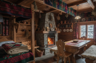
Then there’s the woodwork. Heavy, dark, often hand-carved beams across the ceiling—vigas, they’re called—or corbels jutting out to support nothing in particular except the aesthetic. These weren’t just decorative. In actual Spanish colonial buildings, those beams held up roofs. In Revival homes, though, they’re usually faux, which used to bother me until I realized that almost every design movement involves some degree of theater. The wood is typically walnut or oak, stained deep brown, sometimes with wrought iron straps for extra drama. Doorways get the same treatment: thick wooden doors with iron hardware, the kind that clank heavily when you close them. It all contributes to this sense of weight, of permanence, like the house has been standing for centuries even if it was built in 2003.
Wait—maybe that’s the appeal?
Tile Patterns and Courtyard Logic That Connect Indoor and Outdoor Living
Spanish Revival homes blur the line between inside and outside in ways that feel almost radical if you grew up in, say, New England. The traditional layout often includes a central courtyard or at least a loggia—a covered outdoor corridor with arches—that serves as a transitional space. You’re not quite indoors, not quite out. Tile plays a huge role here. Cement tiles, specifically, hand-poured with geometric or floral patterns, often in blues, greens, and yellows that somehow don’t feel garish even though they should. These tiles originated in North Africa, traveled to Spain during Moorish rule, then made their way to Latin America during colonization. By the time they showed up in California bungalows, they’d been reinterpreted a dozen times. I’ve seen staircases where each riser has a different tile pattern, and instead of looking chaotic, it feels intentional, lived-in. The idea is that your home grows over time, accumulates details. Nothing is supposed to look brand-new.
Courtyards function as the heart of the home, which makes sense in hot climates where you want airflow and shade. Traditional Spanish homes in Andalusia were built around interior patios with fountains, plants, and tiled benches. The Revival versions scaled this down—sometimes just a small patio with a fountain feature and climbing bougainvillea—but kept the logic intact. You move through the house and keep encountering these moments of openness, light, the smell of jasmine or rosemary if someone remembered to plant it. It’s not about grand gestures. It’s about small, repeated sensory experiences that add up.
Honestly, I think that’s what people get wrong when they try to replicate the style today.
Furnishing with Iron, Leather, and Enough Eclectic Objects to Avoid Looking Like a Hotel Lobby
Spanish Revival interiors can tip into theme-park territory fast if you’re not careful. The trick is mixing in enough disparate elements that the space feels collected, not decorated. Wrought iron shows up everywhere—chandeliers, stair railings, window grilles—usually in black or dark bronze finishes. It contrasts with the soft plaster walls and adds a kind of medieval edge, which sounds intense but works when balanced with textiles. Heavy leather furniture, the kind that gets better with age, fits naturally. Not the sleek modern leather you see in Scandinavian minimalism, but thick, distressed, cognac-colored pieces that look like they’ve survived a few decades. Upholstered furniture tends toward rich fabrics—velvets, tapestries, sometimes Suzani textiles from Central Asia, which technically have nothing to do with Spain but share a similar visual density.
Then you layer in ceramics—Talavera pottery from Mexico, Spanish faience, or even Moroccan tagines if you’re going full Mediterranean mash-up. The goal is visual richness without clutter, which is harder than it sounds. I used to think you needed symmetry to pull it off, but Spanish Revival thrives on asymmetry. A carved wooden chest next to a modern lamp. A vintage rug under a contemporary sofa. The house absorbs contradictions. You can throw in a painting that has no business being there, and somehow the space forgives it. Maybe it’s because the architecture itself is already a fantasy—a hodgepodge of influences that never coexisted historically—so adding more eclectic layers just reinforces the vibe. Or maybe I’m overthinking it. Either way, the interiors that work best are the ones that feel like someone actually lives there, not like a designer staged them for a magazine shoot and then locked the doors.
Anyway, that’s the rough outline.

