I used to think mixing patterns was something only interior designers could pull off without making a room look like it exploded.
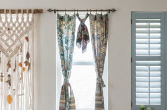
Turns out, the whole thing comes down to understanding scale and repetition—which sounds technical, but really it’s about training your eye to see how a tiny gingham check plays against a large floral print, or how a chunky knit throw can anchor a room full of competing visual noise. The rule of three is everywhere in design writing, and yeah, it applies here too: pick three patterns that share at least one color, vary their scales (small, medium, large), and distribute them unevenly across the space so no single pattern dominates every surface. I’ve seen rooms where someone used the same geometric print on curtains, pillows, and a rug, and it felt less like intentional design and more like they bought out a clearance bin. The trick is to let one pattern be the star—maybe a bold ikat on an accent chair—then support it with quieter, smaller-scale companions like a striped pillow or a subtle dot. Honestly, the 60-30-10 ratio (60% dominant pattern, 30% secondary, 10% accent) gets thrown around a lot, but in practice most people just eyeball it until it feels balanced, which is probably fine.
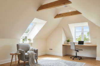
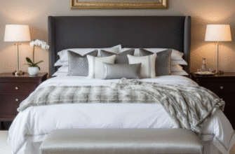
Here’s the thing: texture does half the work that pattern does, but we tend to overlook it because it’s not as visually loud. A room with a velvet sofa, a jute rug, linen curtains, and a ceramic vase has enough tactile variation that you could skip bold patterns entirely and still avoid that flat, catalog look. Wait—maybe that’s why Scandinavian interiors work so well with minimal pattern; they lean hard into texture contrast instead.
The Subtle Science of Keeping Your Eye From Getting Exhausted
Pattern fatigue is real, and it happens when every surface in a room is screaming for attention.
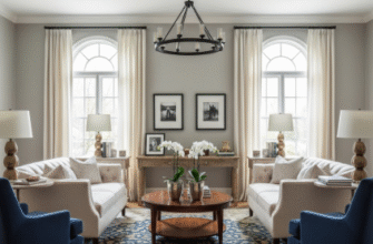
The solution—at least according to most interior designers I’ve read, and some I’ve talked to—is to build in what they call “visual rest areas,” which is just a fancy way of saying: leave some stuff blank. A solid-colored sofa between patterned pillows and a patterned rug gives your brain a place to land. Negative space in design works the same way silence works in music; it makes the noise more intentional. I guess it makes sense that the busiest, most pattern-heavy rooms I’ve seen photos of—like maximalist British sitting rooms or Moroccan riads—also tend to have really high ceilings and lots of natural light, which somehow diffuses the visual chaos. In a small, dark room, you’d want to pull back, maybe stick to two patterns max and let texture carry more weight. The other thing people get wrong is assuming all patterns need to be the same style—like, all geometric or all organic. But mixing a herringbone floor with a floral wallpaper and a striped rug can actually work if the color palette is cohesive, which brings me back to that one-color rule: if everything shares a navy or terracotta or whatever, it holds together even when it shouldn’t.
Texture Layering Without Making Everything Feel Like a Craft Store
Adding texture is where things can go wrong fast if you’re not paying attention.
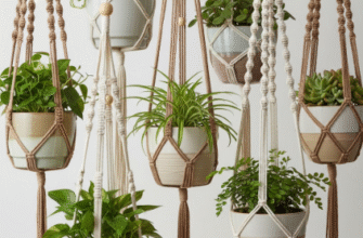
I’ve definately seen rooms where someone threw in a faux fur pillow, a macramé wall hanging, a shag rug, and some rough-hewn wood beads all at once, and it just felt… cluttered, like visual clutter but for your sense of touch. The smarter approach is to think about contrast: smooth against rough, shiny against matte, soft against hard. A leather chair next to a nubby wool throw. A glass coffee table on a sisal rug. A polished marble countertop with a linen table runner. The textures should feel like they’re in conversation, not competition, which is the same principle as pattern mixing but somehow harder to screw up because texture is more forgiving. You can layer a lot of it before it gets overwhelming, especially if you’re working in a neutral palette where the texture itself becomes the main event. Anyway, materials matter too—natural fibers like cotton, linen, wool, and jute tend to play well together because they share a certain organic irregularity, whereas synthetic stuff (polyester, acrylic) can read as flat or cheap unless it’s a really high-quality piece.
The Part Where You Just Have to Trust Your Gut and Stop Overthinking It
At some point, you’ve read enough rules and you just have to start putting things in a room and see what happens.
I used to agonize over whether a striped pillow would clash with a floral one, and then I’d see a designer casually toss both on a sofa with a paisley throw and it looked… fine. Better than fine, actually. The truth is that a lot of successful pattern and texture mixing comes down to confidence and a willingness to edit—if something feels off after living with it for a week, you swap it out. There’s this weird thing where a room can look too coordinated, like everything came from the same showroom on the same day, and that’s almost worse than a little bit of clash because it feels sterile. Some of the best rooms I’ve seen have a slightly chaotic energy, like the person who lives there collected things over time and just made them work. Which, honestly, is probably closer to how most of us actually decorate anyway—not with a master plan, but by adding things we love and hoping they get along.

