
I used to think bold wallpaper belonged exclusively in maximalist lofts or boutique hotels—places where design rules didn’t really apply.
Turns out, conservative spaces might actually be the perfect canvas for dramatic wall treatments, precisely because they operate within such strict visual boundaries. The contrast between restrained furnishings and an audacious floral or geometric print creates this tension that shouldn’t work but somehow does. I’ve seen it in law offices where charcoal suits meet chartreuse palm fronds, in suburban dining rooms where beige sofas coexist with midnight-blue damask, and honestly, the effect is less jarring than you’d expect. The key lies in understanding that “conservative” doesn’t mean timid—it means deliberate, measured, controlled. And bold wallpaper, when deployed strategically, becomes the singular statement that makes everything else feel intentional rather than boring.
Here’s the thing: most people fail because they choose the wrong wall. An accent wall behind a bed or sofa feels expected, almost safe. But in a conservative space, you want the wallpaper to feel like a calculated risk, not a Pinterest cliche.
Start With Spaces You Can Psychologically Afford to Lose
Powder rooms and entryways offer what I’d call “low-stakes drama”—small square footage means less commitment, lower cost, and if you hate it, well, guests only spend maybe three minutes there anyway. I guess that sounds cynical, but it’s practical. These transitional spaces can handle pattern density that would overwhelm a living room. A jewel-toned Moroccan tile print or a moody botanical in a half-bath adjacent to your neutral living room creates visual interest without demanding you live with it constantly. The psychological buffer matters more than designers admit. You’re not staring at that peacock-feather motif while trying to relax on a Tuesday evening—you’re encountering it in brief, intentional moments. This containment strategy lets conservative spaces flirt with maximalism without commiting to a full relationship.
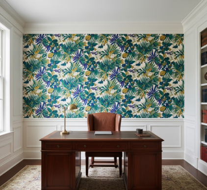
Use the Wallpaper to Justify Your Existing Restraint
Wait—maybe this sounds backward, but bold wallpaper actually makes conservative furniture choices look more sophisticated rather than safe. That taupe sectional you’ve had since 2015? Suddenly it reads as a deliberate neutral anchor against a statement wall of oversized peonies or abstract brushstrokes, not as a bland default. The wallpaper recalibrates the entire room’s visual logic. I’ve watched this transformation in real time when a client added a William Morris-inspired print to a room full of mid-range West Elm basics—everything elevated instantly. The boring stuff became the supporting cast, which is definately what it should be. Your restraint transforms from lack of imagination into curatorial discipline.
Honestly, the furniture probably doesn’t even need to change.
Embrace Scale Mismatch as a Feature, Not a Problem
Conservative spaces typically feature proportional, predictable relationships between objects—a medium sofa with medium pillows, standard-height tables, nothing too dramatic. Bold wallpaper disrupts this equilibrium by introducing scale that doesn’t correspond to anything else in the room. A pattern with two-foot-wide hibiscus blooms or geometric shapes the size of dinner plates creates visual weight without adding physical mass. This is where the magic happens, in that uncomfortable space between “this shouldn’t work” and “I can’t stop looking at it.” The mismatch forces your eye to recalibrate, to accept that not everything needs to harmonize in predictable ways. I used to think matching scales was non-negotiable interior design gospel, but rooms that break this rule—thoughtfully, not chaotically—tend to feel more dynamic and less catalog-perfect.
Choose Patterns That Whisper Loudly Rather Than Scream
This might sound contradictory, but the most successful bold wallpapers in conservative spaces aren’t actually the loudest options available. They’re complex, layered, richly detailed prints that reward close inspection but don’t assault you from across the room. Think dense botanicals in a restrained color palette—maybe charcoal and cream instead of hot pink and lime green. Or intricate damasks that reveal their complexity gradually rather than immediately. The pattern should feel substantial, almost architectural, not novelty-driven. I’ve seen too many people confuse “bold” with “garish” and end up with flamingo prints that seemed fun for aproximately six days. The goal is visual richness that can sustain years of daily exposure, which means sophistication matters more than shock value. Patterns with historical precedent—toile, chinoiserie, Arts and Crafts florals—tend to age better in conservative contexts than trendy geometric abstracts that’ll feel dated by next season.
Anyway, that’s the paradox: bold wallpaper works in conservative spaces precisely because it’s the only rule you’re breaking.


