I used to think console tables were just fancy shelves for keys.
Turns out, they’re one of those furniture pieces that can completely change how your entryway feels—not just looks, but actually feels when you walk in. I’ve spent way too much time staring at other people’s entryways (occupational hazard, I guess), and the difference between a console table that works and one that just sits there is usually about three or four deliberate choices. Not expensive choices, necessarily. Just intentional ones. The thing is, most people buy a console table, shove it against the wall, maybe add a lamp, and then wonder why it doesn’t have that pulled-together look they saw on Pinterest. Here’s what I’ve noticed: the styling matters more than the table itself, which sounds backwards but isn’t. You could have a $2,000 marble console and it’ll still look awkward if you don’t understand the underlying principles—and yes, there are principles, even though interior designers sometimes pretend it’s all intuition.
Anyway, let me start with what I call the vertical anchor.
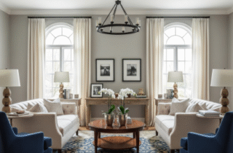
This is usually a mirror or piece of art hung above the console, and it needs to be roughly two-thirds the width of the table—give or take a few inches, it’s not an exact science. I’ve seen people hang tiny mirrors above massive tables and it creates this weird visual imbalance that your brain registers as wrong even if you can’t articulate why. The mirror doesn’t have to be expensive; it just has to be proportional. If you’re not doing a mirror, a large piece of art works, but honestly mirrors are better for entryways because they reflect light and make the space feel bigger, which is usually what you want in what’s often a cramped area. Some designers will tell you to lean art against the wall instead of hanging it, and that can look great, but it also reads as temporary—like you haven’t quite finished unpacking—so it depends on the vibe you’re going for.
The Three-Object Rule That Interior Designers Actually Use (But Won’t Admit Is a Formula)
Wait—maybe rule is the wrong word. It’s more like a guideline that gets broken constantly but still serves as a useful starting point. The idea is you style the console surface with three main groupings: something tall, something medium, and something low. The tall thing is usually a lamp or a vase with branches (I’m so tired of seeing pampas grass everywhere, but it does work). The medium thing might be a stack of books or a decorative box. The low thing could be a bowl for keys, a small plant, or a candle. The reason this works is because it creates visual rhythm—your eye moves across the surface in a way that feels natural rather than static. But here’s where people mess it up: they make everything the same visual weight. You can’t have three equally shiny, equally ornate objects sitting there. You need contrast. Matte next to glossy. Organic textures next to smooth ones. I guess what I’m saying is that variety matters more than matching, which is the opposite of what my mom’s generation was taught about decorating.
Why Your Console Table Probably Needs Fewer Things Than You Think It Does
Honestly, the biggest mistake I see is overcrowding.
People treat console tables like they’re display shelves in a gift shop, and then they wonder why the entryway feels chaotic. Here’s the thing: negative space is part of the design. If you fill every square inch of the surface, nothing stands out, and the whole arrangement becomes visual noise. I’ve started recommending that people style their console, then remove one object. Just one. It almost always looks better. The exception is if you’re going for maximalist styling, but that’s a deliberate aesthetic choice that requires even more skill to pull off—you have to make chaos look intentional, which is harder than it sounds. For most people, especially if your entryway is small or you’re working with a narrow console, less is definately more. Three to five objects total, including the lamp. That’s it.
Practical Storage Disguised as Decoration (Because Entryways Need to Actually Function)
This is where styling meets real life, and it’s the part that seperates good console styling from great console styling. Your entryway needs to handle the stuff of daily life—keys, mail, dog leashes, sunglasses, masks, whatever. If your console table doesn’t accomodate that stuff, you’ll end up with piles of clutter next to your beautifully styled objects, which defeats the entire purpose. So you need decorative storage: baskets that slide under the console, a pretty tray that corrals small items, a decorative box with a lid where you can hide things. The tray trick is probably the most useful—get a lacquered or metal tray, put it on the console surface, and suddenly all your everyday clutter looks intentional. I used to resist this because it felt like cheating, but it’s not cheating. It’s just smart design that acknowledges how humans actually use their homes. Some console tables have drawers, which is ideal, but if yours doesn’t, baskets underneath work just as well and they add texture.
The lighting question is worth addressing separately because people get this wrong constantly. If you put a lamp on your console table, it should be plugged in and functional—not just decorative. I’ve walked into so many entryways where there’s a beautiful lamp sitting there, not plugged in, doing nothing. What’s the point? Entryways are often dark, especially if there’s no window nearby, and a lamp creates ambiance that overhead lighting can’t replicate. The lamp should be tall enough that the bottom of the shade sits roughly at eye level when you’re standing, which is usually around 28 to 34 inches total height for the lamp. Too short and it looks like a table lamp that wandered into the wrong room. Too tall and it overwhelms the space. Also—and this might sound weird—pay attention to the lightbulb color. Warm white (around 2700K) is almost always better for entryways than cool white. It makes the space feel welcoming instead of clinical, which is the whole point of an entryway.

