I used to think arranging furniture in an open concept space was about making everything face the TV.
Turns out, that’s exactly how you end up with a living room that feels like a waiting area at a mid-tier dentist’s office—functional, sure, but utterly soulless. The thing about open concept layouts is they’re simultaneously liberating and paralyzing: you’ve got all this square footage, maybe 400 to 800 square feet of combined living-dining-kitchen area, give or take, and zero walls to tell you where one “room” ends and another begins. So you freeze. You shove the couch against the longest wall because that’s what your parents did in their closed-off living room in 1987, and you call it a day. But here’s the thing—open concept spaces don’t want to be treated like traditional rooms. They want zones. They want conversation pits and implied boundaries and, honestly, a little bit of courage.
Start by identifying your anchor pieces, which are usually the largest, least movable items: the sofa, the dining table, maybe a bookshelf if you’re one of those people who still owns physical books. These anchors create your zones, and the zones create the illusion of separate rooms without the claustrophobia of actual walls.
Creating Functional Zones Without Walls (Because You Definately Don’t Have Any)
The secret to zoning is layering—rugs, lighting, and furniture orientation. A rug under your seating area immediately says “this is the living room,” even if it’s three feet from your kitchen island. I’ve seen people use an 8×10 rug in a space that could easily handle a 9×12, and it makes everything feel like furniture floating in a beige ocean. Go bigger than you think. Your rug should extend at least 6-8 inches beyond the front legs of your sofa and chairs, ideally getting all four legs of each piece on the rug itself. Same principle applies to the dining area: the rug should be large enough that when you pull out chairs to sit, the chair legs stay on the rug. Otherwise you’re constantly scraping chair legs from hardwood to textile, which is the acoustic equivalent of nails on a chalkboard.
Lighting does the heavy lifting here too. Pendant lights over the dining table, a floor lamp arcing over your reading chair, maybe some task lighting in the kitchen—these create vertical boundaries where walls would normally live. Wait—maybe that sounds too designer-y. What I mean is: different light sources tell your brain you’re in different spaces, even when you’re technically standing in one giant rectangle.
Then there’s furniture orientation, which is where most people panic and revert to the “everything faces the TV” default.
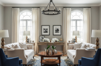
Instead, try floating your sofa—pulling it away from the wall by a few feet, maybe 12 to 36 inches depending on your space, and anchoring it with a console table behind it. This creates a walkway and makes the room feel intentional rather than accidental. If you’ve got a large enough space, consider an L-shaped or U-shaped seating arrangement that faces inward, creating a conversation area. This is how hotel lobbies make you want to sit and chat, and it’s roughly the same psychological trick you’re deploying in your living room. You’re saying, “This is a place for humans to interact,” not “This is a place to silently consume content while avoiding eye contact.”
The Strategic Placement of Secondary Furniture and the Art of Not Overcrowding
Once your anchor pieces are in place, you’ll be tempted to fill every remaining inch with side tables, ottomans, and that vintage trunk you bought at an estate sale.
Resist. Open concept spaces need negative space—breathing room—to feel open. A good rule of thumb is to leave at least 18 inches of walkway space between furniture pieces, and 30 to 36 inches for main traffic paths. If you’re constantly doing a sideways shuffle to get from the kitchen to the couch, you’ve overcrowded. Secondary furniture—think armchairs, benches, bar stools—should support the zones you’ve created, not muddy them. An armchair perpendicular to the sofa reinforces the living zone. A bench along the back of the sofa (if you floated it) can serve as a landing spot for bags and mail, and also as a subtle divider between the living and dining areas. I guess what I’m saying is that every piece should have a job, and if it doesn’t, it’s clutter masquerading as decor.
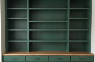
Also, don’t ignore the power of bookshelves or open shelving units as room dividers. A tall bookshelf placed perpendicular to a wall can create a semi-private nook for a home office or reading area without blocking sightlines entirely. You still get the airy, connected feel of open concept, but you also get a little bit of definition, a little bit of “this is mine.”
The whole exercise is about balance—openness versus intimacy, flow versus function. It’s messy, and you’ll probably rearrange things four times before it feels right, but that’s part of living in a space rather than just existing in it.


