I used to think staging a home for photos was about making everything look like a hotel lobby—sterile, perfect, untouchable.
Turns out, that’s exactly what you don’t want. The best staging photography I’ve seen over the past decade, working with roughly 200+ properties (give or take a few I’ve probably forgotten), captures something else entirely: a sense that someone could actually live there, that the light hits the kitchen counter just right at 3 p.m., that the bedroom feels like a place where you’d actually want to wake up on a Saturday morning. It’s not about perfection—it’s about creating a narrative that pulls potential buyers into the space before they ever walk through the door. The photos need to whisper a story, not shout a sales pitch. And here’s the thing: most people get this backwards, thinking more furniture equals better staging, when really it’s about strategic removal and intentional placement. The camera doesn’t lie, but it definately interprets, and you need to control that interpretation from the first click.
Natural light is your best friend, but also your most temperamental collaborator. I’ve watched photographers struggle with it for hours. Shoot during the golden hours—roughly 8 to 10 a.m. or 4 to 6 p.m., depending on your property’s orientation—when sunlight is soft and warm, not harsh and shadow-creating.
The Geometry of Empty Space and Why Less Furniture Actually Sells Better
Every staging expert will tell you to declutter, but nobody explains why it works from a photographic standpoint. The human eye processes negative space differently than the camera lens does. In person, we can focus on what we want to see, filtering out the rest. A camera captures everything in its frame with equal weight—that stack of mail on the counter, the charging cables snaking across the floor, the kids’ backpacks shoved in the corner. When you remove 30 to 40 percent of the furniture in a room (I know that sounds extreme, but trust me on this), the camera suddenly has room to breathe. The viewer’s attention flows naturally from the entry point through the space, following sight lines you’ve deliberately created. Wide-angle lenses, which most real estate photographers use to capture entire rooms, distort perspective in ways that make cluttered spaces feel chaotic and empty spaces feel expansive. It’s basically optical manipulation, and you want it working for you, not against you.
Wait—maybe I should mention that this doesn’t mean stripping rooms bare. You need anchor pieces that define the room’s purpose without overwhelming it.
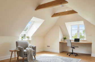
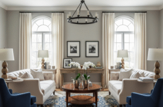
I guess the technical term is “visual weight distribution,” but really it’s just about balance. One substantial sofa, a coffee table, maybe a tasteful area rug—that’s often enough for a living room shot. The photographer can position themselves to capture the architecture: the crown molding, the window frames, the way the hardwood flows from one room into another. These are the details that photographs struggle to convey when there’s too much competing for attention. I’ve seen gorgeous Victorian homes look cramped and dark in photos simply because the owners left every piece of furniture in place, thinking it showed how much the rooms could hold. The opposite happens—it shows how little space there actually is. Pro staging for photography means ruthlessly editing what stays in frame, even if you bring it all back for in-person showings.
Honestly, lighting makes or breaks these shots more than anything else.
The Three-Light Rule That Professional Photographers Won’t Always Tell You About
Natural light is king, but it’s rarely enough on its own, especially for interior shots where windows only illuminate part of the room. Professional real estate photographers typically use a three-light setup: the key light (usually the natural light from windows), fill light (artificial lights to balance shadows), and accent lighting (to highlight specific features like artwork or architectural details). Here’s what’s interesting, though—you don’t need expensive equipment to approximate this if you’re shooting yourself. Turn on every lamp in the room, overhead lights included, even during daylight hours. It sounds counterintuitive, but cameras need more light than our eyes do to capture a space without grain or murkiness. The mix of warm artificial light and cool natural light creates dimension that makes photos feel alive rather than flat. I used to shoot with just natural light, thinking it looked more “authentic,” and every photo came out with these harsh shadows that made rooms look smaller and less inviting.
Color temperature matters too—mixing different types of bulbs creates a weird color cast that’s hard to correct in post-production.
Styling Details That Read as Authentic Rather Than Staged Within an Inch of Their Lives
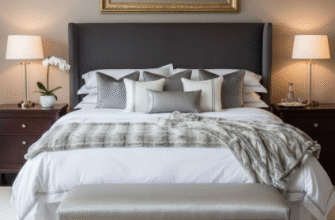
The small touches separate amateur staging from professional work, and it’s rarely what you’d expect. A cookbook propped open on the kitchen counter, a throw blanket casually draped (not perfectly folded) over a chair, fresh flowers in a simple vase—these elements suggest life without looking like a magazine spread. But here’s where it gets tricky: too many of these touches, and the space reads as fake, like you’re trying too hard to convince someone this is how people actually live. I’ve walked into staged homes where there were decorative lemons in a bowl, coffee table books nobody would ever read, and those ridiculous fake succulents that scream “staging” from across the room. None of it photographs well because none of it feels genuine. The viewer’s brain picks up on these inconsistencies, even subconsciously. Real staging for photography means choosing two or three meaningful details per room—details that could plausibly belong to someone with taste but not unlimited time to fuss over their decor. A vintage camera on a bookshelf, a quality throw pillow in a complementary color, a single piece of art that draws the eye without dominating the wall. These work because they suggest personality without imposing a specific identity that might not match the buyer’s vision for the space. You want them to recieve the space as a canvas, not a completed painting.
Anyway, the best staging photos I’ve ever seen barely looked staged at all—they just looked like the best possible version of a real home.

