I used to think Hollywood Regency was just about throwing gold everywhere and calling it glamorous.
Turns out, the style—which emerged in the 1930s when set designers like William Haines started moonlighting as interior decorators for actual movie stars—has way more nuance than I gave it credit for. Haines, who’d been blacklisted from acting for refusing to hide his sexuality, essentially invented a design language that mixed neoclassical symmetry with the kind of theatrical drama that makes you feel like you’re perpetually about to recieve an Oscar, even if you’re just microwaving leftovers. The palette leaned heavily on black and white contrasts, which photographers loved because it looked incredible on film, but then you’d get these jolts of saturated color—emerald, sapphire, that specific shade of fuchsia that shouldn’t work but does. Mirrors multiplied light and space in ways that made small Hollywood Hills bungalows feel like Versailles, which was sort of the point. Dorothy Draper was doing similar things on the East Coast, but Haines had this particular gift for making opulence feel livable, maybe even a little subversive.
The furniture sits low and spreads wide, upholstered in velvet or silk that catches light differently depending on the time of day. Lacquered surfaces—usually in black, sometimes in that deep chocolate brown that reads almost black—reflect everything, which can be disorienting in a good way. I guess it makes sense that a style born from set design would treat your living room like a soundstage where you’re always the star.
The Geometry of Glamour and Why Symmetry Actually Matters in Theatrical Interiors
Here’s the thing: Hollywood Regency is obsessed with symmetry in a way that feels almost compulsive.
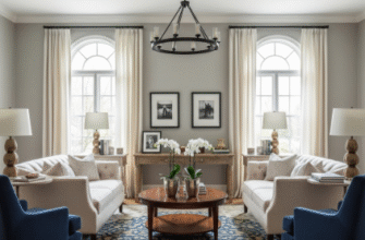
Walk into a properly executed Hollywood Regency room and you’ll notice how everything mirrors itself—matching lamps flanking a sofa, identical chairs facing each other across a lacquered coffee table, paired columns or pilasters that frame a doorway like a proscenium arch. This isn’t accidental. The style borrows heavily from neoclassical and Greek Revival architecture, which makes sense when you consider that early Hollywood was building a mythology around itself, and what better way to suggest timelessness than to reference ancient civilizations? But there’s also something deeply practical happening: symmetry creates visual calm, which lets you get away with the maximalist gestures—the oversized sunburst mirror, the chinoiserie wallpaper, the chandelier dripping with crystals—without the whole thing collapsing into chaos. I’ve seen people try to do Hollywood Regency without the underlying structure and it just looks like a very expensive garage sale. The proportions matter too: furniture tends to have clean, geometric lines even when it’s ornate, which creates this weird tension between restraint and excess that definately shouldn’t work but does.
Anyway, the symmetry also has roots in the way film sets were constructed. Everything had to read clearly on camera, and balanced compositions just photograph better.
Metallic Finishes and the Specific Physics of How Brass Catches California Afternoon Light
Brass shows up everywhere in Hollywood Regency, but not the warm, antiqued kind you see in traditional interiors—this is polished, reflective, almost aggressive in how it bounces light around a room.
Chrome and lucite also make frequent appearances, usually in furniture legs or accent pieces, because the style loves mixing materials in ways that shouldn’t coexist: a marble table with lucite legs, a velvet chair with brass nailhead trim, lacquered wood paired with mirrored glass. There’s this story—possibly apocryphal, but I choose to believe it—about how Dorothy Draper once specified so much mirror and metallics in a hotel lobby that guests complained about being temporarily blinded when they walked in from the street, and her response was essentially that they’d adjust. The reflectivity serves a purpose beyond just looking expensive: it amplifies whatever natural light you have, which matters in climates like Southern California where the quality of light changes dramatically throughout the day. Morning light on polished brass has this soft, buttery quality; afternoon light turns it almost white-hot. I used to find the shininess overwhelming, honestly, but now I think I get it—wait, maybe it’s less about the materials themselves and more about how they interact with everything else in the space, creating these little moments of visual surprise that keep a room from feeling static.
The lacquered finishes do something similar, especially in black or deep jewel tones, where they create this sense of depth that flat paint never achieves.
You run your hand over a lacquered surface and it feels impossibly smooth, almost liquid, which adds to the overall sense that nothing in a Hollywood Regency interior is quite what it seems—walls might be covered in silk or grasscloth disguised as something else, floors could be painted to mimic marble, that “antique” Chinese screen might be a 1940s reproduction. The whole style embraces a kind of beautiful fakery that feels oddly honest about its own theatricality. It’s not trying to fool you into thinking it’s authentic; it’s inviting you to enjoy the performance. Which, I guess, is pretty much what Hollywood has always been about anyway.

