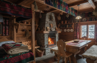
I used to think Czech interiors were all about those heavy wooden beams and dark, suffocating spaces.
Turns out, the real magic happens when you start peeling back the layers of a 19th-century Prague apartment and find—wait, maybe this is obvious to some people—that you can actually honor the bones of a place without turning it into a museum. The thing about Czech design, especially in cities like Prague or Brno, is that it’s built on this foundation of Austro-Hungarian craftsmanship, where every ceiling medallion and parquet floor pattern meant something, where plaster moldings weren’t just decoration but a kind of architectural grammar. You walk into these spaces and there’s this weight, this sense that people have been living here for a hundred-plus years, and honestly, it can feel overwhelming if you don’t know how to work with it. But here’s the thing: contemporary Czech designers have figured out how to strip away the oppressive heaviness—the dark wallpapers, the clutter of porcelain figurines—while keeping the elements that actually matter, the ones that make you catch your breath when you first step inside.
Which brings me to the whole question of how you balance preservation with livability. I guess it’s not rocket science, but it requires a kind of confidence. You keep the original hardwood floors, maybe refinish them in a lighter stain. You expose brick where it makes sense, not everywhere.
Architectural Elements That Refuse To Be Erased Completely
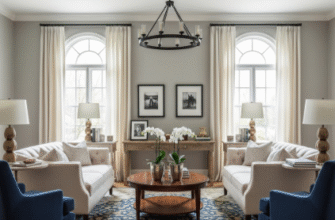
The crown moldings in a typical Czech apartment—especially in buildings from the 1880s through the early 1900s—are these elaborate plaster affairs that run eight, ten inches deep. Designers I’ve talked to in Prague say they’ll often paint them white or even a soft gray to make them receed visually, rather than ripping them out, which would be both expensive and, honestly, kind of vandalistic. High ceilings, usually around 3.5 meters, give you room to play with vertical space, to hang contemporary light fixtures that would look absurd in a standard apartment. There’s this one project I remember seeing in Vinohrady where they left the original ceramic tile stove—those big green or white towers that heat entire rooms—but surrounded it with minimalist furniture, Scandinavian-style stuff, and the contrast was jarring in the best way. The stove became sculpture. It’s that kind of thinking that defines this approach.
Color Palettes That Somehow Bridge Two Centuries Without Feeling Forced
Honestly, this is where a lot of people mess up.
They’ll go full white-on-white thinking it’s modern, but then the space feels cold, disconnected from its history. Czech designers tend to use warm neutrals—think linen, taupe, soft terracotta—that echo the natural materials already present in these old buildings. You’ll see deep blues or forest greens as accent colors, which nod to the traditional painted furniture you’d find in Moravian folk styles, but applied in contemporary ways, maybe just on one feature wall or in textiles. There’s also this growing trend of exposing the original paint layers, letting the patina show through, which sounds messy but when done right creates this sense of accumulated time. I’ve seen apartments where they’ve deliberately left sections of wall half-stripped, and it shouldn’t work, but it does because it tells a story about the building’s life.
Furniture Choices That Don’t Try To Compete With The Architecture
The furniture has to be almost deferential, I think. Mid-century modern pieces work surprisingly well—those clean lines, the wood tones—because they don’t fight with the ornate historical details. You’ll often see a mix of Czech-made pieces from the 1960s and 70s, stuff from companies like TON or Interier Praha, combined with contemporary designs. The key is keeping things low-profile, not blocking the windows or obscuring the architectural features. I used to wonder why so many Czech interiors felt so uncluttered compared to, say, French or Italian spaces with similar historical pedigree, and I think it’s because there’s this cultural memory of the Communist era when excess was frowned upon, so there’s already this built-in tendency toward restraint.
Lighting Strategies That Actually Make These Dark Spaces Feel Habitable Today
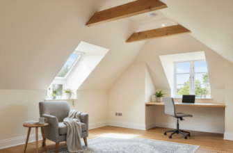
Here’s the thing nobody tells you: these old buildings are dark. Windows are often smaller than you’d expect, walls are thick, and if your apartment faces a courtyard rather than the street, you’re working with limited natural light. Contemporary updates almost always involve adding multiple light sources—pendant lights, floor lamps, LED strips hidden in coves—to compensate. I guess it’s definately one area where you can’t just rely on historical fixtures. Designers will sometimes add skylights if the apartment is on the top floor, or install larger windows if the building’s facade permits it. There’s also this clever trick of using mirrors strategically to bounce light around, which sounds obvious but requires careful placement so you’re not just reflecting that heavy ornamental stuff everywhere. The goal is to make these spaces feel lived-in and comfortable for modern life—work-from-home setups, open kitchens, all that—without erasing the fact that they’ve been standing here, weathering history, long before any of us showed up.

