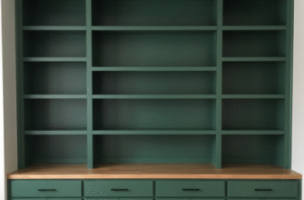
I used to think asymmetry in a room meant chaos, like someone had just given up halfway through decorating.
Turns out, that’s not how visual weight works at all. When you’re dealing with an asymmetrical layout—say, a living room where one side has massive floor-to-ceiling windows and the other has a tiny doorway and some shelves—you’re essentially trying to balance a seesaw that has different weights on each end. Except the weights aren’t actual pounds or kilograms; they’re perceptual. A dark, heavy armoire pulls your eye harder than a pale linen sofa, even if the sofa is physically larger. Color density matters. Texture matters. Even the empty space around an object contributes to how much visual gravity it exerts. I’ve seen rooms where a single black accent chair in a corner balances an entire wall of white built-ins on the opposite side, and it works because our brains are weird like that.
Anyway, the first trick is understanding that visual weight isn’t about symmetry—it’s about equilibrium. You can have a heavy element on one side and three lighter elements on the other, and if the combined perceptual mass feels equal, the room settles. It’s like when you’re arranging furniture and something just clicks, even though nothing matches.
Why Our Brains Hate Imbalance (But Love Controlled Chaos)
Here’s the thing: humans are wired to seek balance, probably because our ancestors needed to spot predators in uneven landscapes or something.
When a room feels lopsided, it triggers this low-level unease—not panic, just a vague sense that something’s off. Researchers in environmental psychology have measured this; people spend less time in asymmetrical spaces that lack compensatory visual anchors, and they report feeling less comfortable, though they often can’t articulate why. The brain is constantly calculating weight distribution, even when you’re not consciously aware of it. A room with a massive stone fireplace on one wall and nothing but blank drywall on the other feels unfinished, like a sentence that just stops mid—wait, that’s actually a decent metaphor. The fireplace is a visual exclamation point, and the blank wall is dead air. You need something over there to answer it, even if it’s just a tall plant or a piece of art that has enough heft to register.
Dark Colors and Dense Textures Pull Harder Than You’d Think
I guess it makes sense when you think about it, but a charcoal velvet sofa commands way more attention than a white cotton one of the exact same dimensions.
Dark hues absorb light, which makes them feel heavier, denser, more anchored. That’s why interior designers will sometimes put a dark rug or a deep-toned piece of furniture on the lighter side of an asymmetrical room—it’s a counterweight. Texture does something similar: a rough, chunky knit throw or a reclaimed wood coffee table has more visual mass than smooth, glossy surfaces. I’ve noticed this in my own space, where a single rust-colored ceramic vase on a shelf somehow balances three minimalist picture frames on the opposite wall. It shouldn’t work, but it does, because the vase has density and the frames are just floating lines. The trick is layering these elements intentionally, not randomly.
Vertical Elements Create Optical Leverage (Seriously)
Tall objects—bookshelves, floor lamps, vertical art—act like levers.
They pull the eye upward, which redistributes visual weight in a way that horizontal elements don’t. If one side of your room has low, sprawling furniture and the other has a single tall cabinet, the cabinet wins the attention war even if it’s smaller in overall square footage. This is why you’ll see designers place a floor-to-ceiling curtain on one side of a room to balance a chunky sectional on the other. The curtain is mostly empty fabric, but its height gives it presence. I used to ignore vertical space entirely, thinking only about what was at eye level, and my rooms always felt bottom-heavy and weird. Now I’m obsessed with adding tall, narrow elements wherever things feel too squat. It’s like giving the room a spine.
Empty Space Isn’t Neutral—It Has Weight Too
This one messed me up for a while.
You’d think blank wall space or an open floor area would just be… nothing. But negative space actually contributes to the overall balance, especially in asymmetrical layouts. A large empty zone on one side of the room can feel just as heavy as a piece of furniture if it’s framed right—like if it’s bordered by molding or if the flooring changes texture there. Japanese interior design does this constantly, using intentional voids as compositional elements. In Western spaces, we tend to panic and fill every gap, but sometimes the emptiest corner is what makes the crowded corner tolerable. I saw a room once where the designer left an entire wall bare except for one small sculpture on a pedestal, and it perfectly balanced a gallery wall of maybe fifteen prints on the opposite side. The void had its own gravity.
How to Actually Test If Your Room Feels Balanced (Without Overthinking It)
Honestly, the easiest method is to stand in the doorway and squint.
I know that sounds ridiculous, but when you blur your vision, you stop seeing individual objects and start perceiving masses of light and dark. If one side of the room looks like a black hole and the other looks washed out, you’ve got an imbalance. Move things around—swap a light chair for a dark one, add a textured throw, shift a lamp—and squint again. You’ll know when it clicks because the room will suddenly feel anchored, like all the visual tension has resolved. Some people take photos and convert them to grayscale, which does the same thing but feels more scientific. Either way, you’re looking for a distribution of tonal weight that doesn’t make your brain itch. It’s not about perfection; it’s about reducing that nagging sense that the room is about to tip over.

