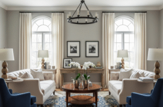
I used to think monochromatic schemes were boring—like, aggressively boring.
But here’s the thing: somewhere between my third apartment repaint and accidentally discovering a charcoal-grey bedroom that made me feel like I’d entered a luxury hotel, I realized I’d been getting it completely wrong. Monochromatic doesn’t mean monotonous, turns out. It means layering shades of a single color family—navy to powder blue, charcoal to pearl grey, forest to sage—in ways that create depth without the visual chaos of contrasting hues. The human eye, which can distinguish roughly 10 million color variations (give or take, depending on whose research you trust), actually finds relief in these tonal progressions. We’re pattern-seeking creatures, and monochromatic palettes satisfy that neurological craving while simultaneously delivering what interior designers call “visual rest.” It’s exhausting, honestly, how much mental energy our brains expend processing busy, multi-colored environments.
Wait—maybe that sounds too scientific. Let me back up. When you walk into a room dressed entirely in variations of one color, something weird happens to your perception of space. The boundaries blur slightly, walls recede or advance depending on value shifts, and suddenly you’re noticing texture in ways you never did before.
The Architecture of Shadows: Why Tonal Variation Creates Perceived Complexity
Light behaves differently across tonal ranges, and this is where monochromatic schemes get their sophistication. A cream sofa against an ivory wall against a linen curtain in ecru—these aren’t “the same,” even though your friend who doesn’t care about design will definitely say they are. Each surface absorbs and reflects light at slightly different rates, creating micro-shadows and highlights that change throughout the day. I’ve spent probably too much time photographing my own living room at different hours, watching how morning light makes the pale taupe walls look almost lavender while evening sun brings out hidden warmth. Natural light contains the full visible spectrum (roughly 380-700 nanometers, though I always forget the exact range), and monochromatic surfaces act like filters, emphasizing different wavelengths depending on their undertones. This is why a “simple” grey room can feel cool and modern at noon but warm and enveloping at twilight.
The trick—if there even is one—involves mixing finishes more than colors. Matte absorbs, gloss reflects, satin does something in between. Layer those textures in similar hues and you get visual interest without the committment to bold color choices.
Anyway, there’s also a psychological component that researchers keep finding in environmental psychology studies.
The Unexpected Neuroscience Behind Single-Hue Environments and Decision Fatigue
Our brains make thousands of micro-decisions daily about visual input, and color variety increases that cognitive load in ways we don’t consciously register. A 2018 study from the University of Texas (I think it was Texas—definitely somewhere in that region) found that subjects in monochromatic environments reported lower mental fatigue after completing complex tasks compared to subjects in multi-colored spaces. The theory goes that reducing chromatic variation frees up neural bandwidth for other processing. Which sounds incredibly nerdy when I write it out, but it matches what I’ve observed: my focus improves in my navy-on-navy home office compared to the living room with its jewel-tone chaos. Monochromatic schemes essentially remove one variable from the equation, letting your attention settle on form, proportion, spatial relationships. It’s like noise-canceling headphones for your visual cortex, filtering out chromatic static so you can percieve the underlying structure.
I guess it makes sense that luxury brands have known this forever—Chanel’s beige interiors, Armani’s greige everything, those minimalist Scandinavian spaces that feel expensive despite having like four pieces of furniture.
Practical Layering Techniques That Actually Work in Real Rooms Without Looking Washed Out
Here’s where most people mess it up: they choose variations that are too similar. You need contrast within your monochrome—not color contrast, but value contrast. If you’re going blue, you need something approaching navy and something near powder, with mid-tones bridging the gap. I learned this the hard way after painting every surface in my bathroom the same shade of sage and creating what can only be described as a sensory deprivation chamber. The fix involved darker tiles, lighter linens, medium-toned wood—suddenly the space had dimension again. Metallic accents help too, functioning as neutral anchors that catch light without introducing competing hues. Brass in a cream room, blackened steel in greys, copper in browns—these add visual punctuation marks. And honestly, don’t be afraid of going dark; some of the most sophisticated monochromatic spaces I’ve encountered were entirely charcoal or deep burgundy, relying on texture and finish variation to prevent cave-like oppression.
The whole thing requires more thought than just slapping paint on walls, but way less agonizing than trying to coordinate six different accent colors. Which, after years of design mistakes, feels like a reasonable tradeoff.

