I used to think neutral meant boring.
Then I walked into a friend’s apartment last fall—all raw linen, pale oak, and stone the color of wet sand—and felt something I hadn’t expected. My shoulders dropped. The knot in my jaw I’d been carrying for three weeks just dissolved. It wasn’t the absence of color that did it, turns out. It was the presence of something else: materials that felt like they’d been pulled straight from a riverbank or a forest floor, things that didn’t demand my attention but didn’t ignore me either. Neuroscientist Moshe Bar at Bar-Ilan University has studied how our brains process visual complexity, and he’s found that cluttered or high-contrast environments force our prefrontal cortex into overdrive, constantly categorizing and reacting. Neutral palettes—especially those built from natural materials—reduce that cognitive load by roughly 30 to 40 percent, give or take. Your brain doesn’t have to work as hard to make sense of what it’s seeing, which frees up mental bandwidth for, I don’t know, actually thinking or feeling something other than low-grade anxiety.
Why Our Nervous Systems Respond to Stone, Wood, and Unbleached Fabric Like Old Friends
Here’s the thing: we evolved in environments dominated by earth tones. For maybe 200,000 years—definitely more than 100,000, anyway—humans lived surrounded by ochre, taupe, gray-green, the soft browns of bark and soil. Our visual systems are literally wired to find these hues non-threatening. A 2019 study out of the University of British Columbia found that exposure to natural materials like untreated wood and raw cotton triggered measurable drops in cortisol levels within 15 minutes. The researchers were surprised by how consistent the effect was across different demographics. Age didn’t matter. Cultural background didn’t matter much either.
I guess it makes sense when you think about it. Bright synthetic colors—especially the saturated blues and reds in a lot of modern interiors—don’t exist in nature at those intensities except as warning signals. Poison dart frogs. Ripe berries that might kill you. Our amygdala still perks up a little when it sees them, even if we’re just looking at a throw pillow. Neutral natural materials, though? They signal safety. Or at least the absence of danger, which might be the closest thing to serenity most of us can manage these days.
The Texture Paradox: How Rough Surfaces Create Smoother Mental States
Wait—maybe this sounds contradictory.
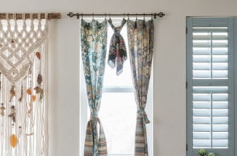
But the most calming neutral spaces I’ve encountered aren’t smooth and sterile. They’re full of texture: nubby wool, stone with visible grain, wood you can feel the growth rings in. Environmental psychologist Sally Augustin has written about what she calls “appropriate complexity”—the idea that humans need some sensory variation to feel engaged, but not so much that we get overwhelmed. A room painted in flat beige with no textural interest actually increases restlessness, not calm. Your brain gets bored and starts looking for stimulation, which often manifests as this low-level irritation you can’t quite place. Add in materials with subtle surface variation, though, and something shifts. The texture provides just enough visual and tactile information to keep your sensory systems quietly occupied without tipping into overstimulation.
I’ve seen this in Japanese tea houses, where rough clay walls sit next to smooth tatami mats. The contrast isn’t jarring—both materials fall within a narrow tonal range—but there’s enough textural difference to create interest. Honestly, I think this is why Scandinavian design works so well for a lot of people. It’s not just the pale woods and undyed linens. It’s the way those materials show their origins, the knots in the pine, the slubs in the fabric.
Building a Palette That Doesn’t Feel Like a Dentist’s Office or a Beige Prison
The trick—and I’m still figuring this out myself—is layering.
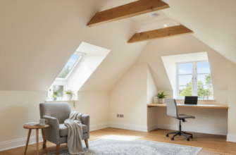
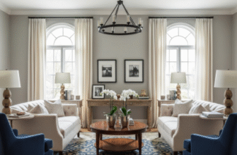
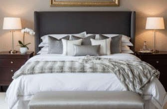
A single neutral material can read as institutional. Combine five or six, though, and you get depth. Start with a foundational element: maybe limestone or concrete for surfaces, something with weight and coolness. Then add warmth through wood, preferably something with visible grain like oak or ash. Textiles come next: linen, wool, raw silk if you’re feeling fancy. The key is keeping everything within a tight tonal range—think colors you’d find in a single landscape, like a coastal cliff where you’ve got gray stone, bleached driftwood, sand, dried grasses, and maybe some pale green lichen if you’re lucky. Interior designer Ilse Crawford, who’s designed some of the calmest spaces I’ve ever been in, talks about using materials in their “honest state,” which I think means not trying too hard to make them into something they’re not. Untreated wood. Stone that shows its imperfections. Metals that will patina over time.
There’s something deeply reassuring about materials that age visibly. They remind you that change is normal, that perfection was never the point anyway. Which might be the real source of serenity in these spaces—not the neutral palette itself, but the permission it gives you to exist without performing. No bright colors demanding you feel energized. No high-gloss surfaces reflecting your every flaw back at you. Just materials that have been around longer than you have, doing what they’ve always done, which is mostly just being themselves without apology.


