
I used to think focal points were just designer speak for “put a big couch here.”
Turns out the science behind how our eyes move through a room is way more fascinating than I expected—and honestly, kind of exhausting when you realize how much our brains are doing without us even noticing. Neuroscientists have been studying visual saliency for decades now, which is basically the fancy term for what grabs our attention first when we walk into a space. The human eye doesn’t scan a room evenly like some kind of biological camera; it jumps around in these rapid movements called saccades, roughly 3-4 times per second, and our brain is constantly trying to predict where to look next based on contrast, color, and what psychologists call “visual weight.” A study from MIT in 2018 found that people’s eyes land on high-contrast areas within about 200 milliseconds of entering a room—give or take—which explains why that bright painting or weird lamp always seems to pull focus even when you’re trying to have a conversation.
The Architecture of Attention: Why Symmetry Isn’t Always Your Friend
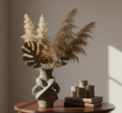
Here’s the thing: our brains are wired to notice asymmetry and disruption, not perfect balance. I’ve seen so many living rooms where everything is matchy-matchy, two identical lamps flanking a centered sofa, and the result is… nothing catches your eye at all. Evolution trained us to spot irregularities because that’s where the predators—or food—usually were hiding. Modern interior designers have figured out how to exploit this: they’ll place a single oversized sculpture in a corner, or hang artwork off-center, deliberately creating visual tension that your eye has to resolve.
Wait—maybe that sounds manipulative? It kind of is. But it also makes spaces feel alive rather than sterile.
The concept of “visual hierarchy” comes from graphic design originally, but it applies perfectly to rooms: you need a primary focal point, maybe one or two secondary ones, and then everything else should recede into the background. I guess it’s like composing music—you can’t have every instrument playing fortissimo or it’s just noise. In a dining room, the primary focal point might be a chandelier (which activates our upward gaze, something humans do instinctively when entering unfamiliar spaces), while a secondary point could be a sideboard with interesting objects. The trick is contrast: if your walls are light, your focal point needs to be dark or textured or weirdly shaped.
Color Psychology and the Emotional Manipulation We Definately Don’t Talk About Enough
Red advances. Blue recedes.
That’s not poetry—that’s actual perceptual psychology, and it’s been tested in countless studies since the 1960s. Warm colors (reds, oranges, yellows) literally appear closer to us than cool colors (blues, greens) even when they’re on the same plane, which is why a terracotta accent wall can make a room feel smaller but also more intimate and focused. I used to think this was subjective preference until I read about the opponent-process theory of color vision, which explains how our retinal cells are wired to process warm and cool colors through competing neural pathways. Anyway, designers use this ruthlessly: a burnt orange chair in a sea of gray will pull your eye across the room whether you want it to or not. The emotional component is harder to pin down—some researchers claim red increases heart rate slightly (though the effect size is small), while blue tends to lower it. Whether that translates to “excitement” versus “calm” in a lived-in space is debatable, but the visual pull is real.
Lighting as the Invisible Hand That Directs Everything (And We Barely Notice It)
Honestly, if you get the lighting wrong, nothing else matters.
Our eyes are drawn to light sources instinctively—another evolutionary holdover from when fire meant warmth and safety and not dying in the dark. Modern lighting designers layer three types: ambient (overall illumination), task (for specific activities), and accent (to highlight focal points). That third category is where the magic happens: a picture light over a painting, uplighting on a textured wall, or even a floor lamp positioned to graze a sculpture can create dramatic shadows and depth that pull focus. There’s this phenomenon called the “moth effect” that isn’t a real scientific term but probably should be—people gravitate toward lit areas in dimly lit rooms, which is why restaurants put candles on tables and why a glowing fireplace becomes the center of any gathering even when it’s not cold. I’ve noticed that rooms with only overhead lighting feel flat and directionless; your eye doesn’t know where to go because everything is equally illuminated, which our pattern-seeking brains find vaguely unsettling.
The trick is creating contrast again: pools of light in a moderately dim room will guide the eye in sequence, almost like reading a visual story from one focal point to the next.
Maybe I’m overthinking this—people have been arranging rooms for thousands of years without knowing about saccades or opponent-process theory. But there’s something satisfying about understanding why certain spaces feel right and others don’t, why your attention keeps drifting to that one corner or that specific object. It’s not magic. It’s biology, physics, and a little bit of calculated manipulation that, when done well, you never even notice is happening.


