I used to think high contrast was just about black and white.
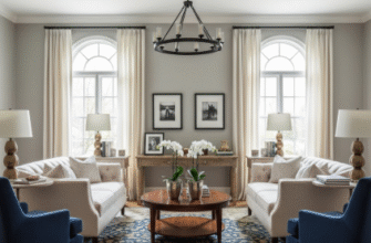
Turns out, the whole concept of elegance through contrast is way more nuanced than that—and honestly, more frustrating to nail down than I expected when I first started paying attention to how designers actually use color. There’s this moment when you’re looking at a room or a website or even just someone’s outfit, and something clicks, and you realize the contrast isn’t just about light versus dark, it’s about tension and balance and this weird psychological thing where your brain simultaneously relaxes and wakes up. I’ve seen interior designers spend hours debating whether a navy blue is dark enough to contrast with cream, or if they need to go full midnight. The stakes feel absurdly high for what’s essentially just paint, but here’s the thing: when you get it right, the space doesn’t just look good—it feels intentional, almost architectural in its precision.
Anyway, the science behind why high contrast works is kind of fascinating. Our visual cortex processes edges and boundaries before it processes anything else, which means high contrast combinations literally grab our attention first. It’s not a choice we’re making consciously—it’s hardwired.
The Neurological Pull of Stark Juxtapositions in Visual Fields
Wait—maybe I should back up and explain what I mean by “high contrast” beyond the obvious. Yes, black and white is the classic example, but you can achieve similarly striking effects with deep emerald against blush pink, or charcoal gray paired with bright coral, or even chocolate brown with ice blue. The key is the difference in luminosity—basically, how much light each color reflects. When that difference is dramatic, roughly 70% or more on the luminosity scale (give or take, depending on which color theorist you ask), you get that crisp, elegant tension. I guess it makes sense when you think about it: our ancestors needed to spot predators against backgrounds, distinguish ripe fruit from leaves, notice movement in shadows. High contrast meant survival, so our brains evolved to find it not just noticeable but somehow satisfying.
The fashion industry figured this out decades ago. Think of a black tuxedo with a white shirt—it’s been the standard for formal elegance since, what, the 1800s? That combination never feels dated because it taps into something fundamental about how we percieve visual harmony.
When Elegance Meets Practicality in Contemporary Design Spaces
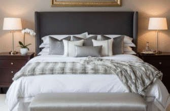
Here’s where it gets tricky, though. Too much contrast can feel harsh, almost aggressive, especially in spaces where you’re supposed to relax. I’ve walked into living rooms where every surface was either stark white or deep black, and instead of feeling elegant, it felt like being inside a chess board—visually exhausting. The secret, according to most designers I’ve talked to, is the 60-30-10 rule: 60% of your dominant color (usually the lighter one), 30% of your secondary color (the dark contrast), and 10% of an accent that bridges the two. That accent color is doing more work than you’d think, giving your eye a place to rest, softening the edges of the contrast just enough that it feels deliberate rather than jarring. Metallics work particularly well for this—gold or brass can warm up a black-and-white scheme, while silver or chrome keeps things cool and modern. But honestly, even a medium gray or a soft taupe can do the job, as long as it’s placed strategically.
This applies way beyond interior design, obviously.
Web designers use high contrast to guide user attention—call-to-action buttons in bright colors against muted backgrounds, white text on dark hero images, navigation bars that pop against content areas. There’s actually a whole accessibility component here too: the Web Content Accessibility Guidelines (WCAG) require a contrast ratio of at least 4.5:1 for normal text to ensure readability for people with visual impairments. So high contrast isn’t just aesthetically elegant—it’s functionally necessary for inclusive design. I used to think accessibility requirements were constraints, but turns out they often push designers toward bolder, more striking choices that end up looking better anyway.
The Psychological Weight of Color Contrast and Spatial Perception Dynamics
Then there’s the emotional dimension, which nobody really talks about enough. High contrast feels decisive, confident, even a bit formal—which is why it works so well for luxury brands and corporate identities. But it can also feel energizing or dramatic depending on the specific colors you choose. Black and red? Intense, almost dangerous. Navy and white? Nautical, crisp, trustworthy. Deep purple and cream? Regal, sophisticated, slightly mysterious. The contrast creates the structure, but the actual hues carry the emotional weight. I guess that’s what makes it such a versatile tool—you can definately adapt the mood while maintaining that elegant, high-impact look. The contrast itself becomes a kind of framework that lets the colors do their expressive work without getting muddy or confused.
Honestly, once you start noticing high contrast in the world around you, you can’t stop seeing it everywhere.

