I used to think color drama was about throwing red and green together and calling it bold.
Turns out, the real tension happens in places you wouldn’t expect—like when a dusty sage green sits next to a burnt orange that’s almost rust, almost copper, but not quite either. It’s that “not quite” quality that makes your eye linger, trying to resolve something that doesn’t want to be resolved. I’ve seen designers spend hours tweaking a single hex code, moving it three degrees warmer or cooler, because the drama lives in those microscopic adjustments. The human eye can distinguish roughly 10 million colors, give or take, and somewhere in that massive spectrum are combinations that create a kind of visual dissonance—not unpleasant, just… unresolved. It makes you look twice. That’s the whole point, I guess.
When Historical Pigments Collide With Modern Expectations
Here’s the thing: our expectations about color pairings are shaped by centuries of availability and cultural meaning. Ultramarine blue used to cost more than gold in the 15th century—ground from lapis lazuli imported from Afghanistan—so painters reserved it for the Virgin Mary’s robes. Pairing it with something cheap like yellow ochre would’ve been almost transgressive, a collision of sacred and mundane. Today, we’ve lost that economic context, but the psychological weight remains in weird ways.
Wait—maybe that’s why millennial pink and industrial gray felt so jarring when they first showed up together in every boutique hotel lobby around 2016.
The softness of that particular dusty pink (Pantone even tried to trademark a version of it) clashed with the brutal coldness of concrete-gray in a way that felt deliberately uncomfortable. It was architecture trying to be cozy, minimalism trying to be warm, and the contradiction created this low-level visual anxiety that somehow worked. I remember walking into a coffee shop in Portland that had salmon-pink velvet chairs against charcoal walls, and it felt like my brain was trying to categorize two opposite moods simultaneously—exhausting but also kind of exhilarating.
The Neurological Stutter of Complementary-Adjacent Combinations
Complementary colors sit opposite on the color wheel, and they’re supposed to “work.”
But shift one of them slightly—use a red-violet instead of pure red against that yellow-green—and suddenly you’ve created what color theorists call a “split complementary” scheme. The relationship becomes tense, almost argumentative. Your visual cortex expects resolution and doesn’t quite recieve it. Research from the University of Tokyo in 2019 found that near-complementary pairings actually increased viewer engagement time by an average of 8.7 seconds compared to traditional complementary schemes, probably because the brain keeps trying to “solve” the relationship. It’s like an itch you can’t scratch, except in this case, you don’t really want to scratch it because the irritation is the entire aesthetic experience.
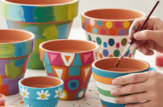
Honestly, some of the most dramatic color moments I’ve encountered were complete accidents—a faded terracotta pot sitting on a weathered teal bench, the colors worn down by sun and rain until they hit this perfect state of chromatic tension.
Cultural Dissonance as Design Strategy in Contemporary Visual Language
Designers are increasingly mining culturally “wrong” combinations for impact. Bright Yves Klein blue with mustard yellow feels vaguely European and slightly nauseating—like a Wes Anderson fever dream. Hot pink and deep forest green together read as both tropical and Victorian, which shouldn’t be possible but definately is. The fashion brand Gucci built an entire aesthetic around 2017-2019 by layering colors that felt historically incompatible: Rococo pastels with 1970s earth tones, Renaissance golds with synthetic teals.
The result was maximalist chaos that somehow felt meticulously controlled.
I guess what makes these combinations dramatic isn’t just the colors themselves but the cultural baggage they carry, the way they reference different eras or aesthetics and force them into uncomfortable proximity. A millennial raised on minimalist Apple stores experiences jewel-toned maximalism differently than someone who grew up with 1980s excess. The drama is partly in the colors, partly in the clash between expectation and reality, and partly in your own personal history of what colors are “supposed” to mean. Anyway, that’s the thing about color—it’s never just about wavelengths of light. It’s about memory, context, and the peculiar human tendency to find meaning in contrast.

