
I used to think matching all your hardware was some kind of unspoken design law.
Then I walked into a friend’s kitchen—brushed brass cabinet pulls, matte black faucet, polished chrome light fixture—and it worked. Not in spite of the mix, but because of it. The finishes weren’t fighting; they were layered, like someone had actually lived there and made choices over time instead of ordering everything from the same catalog page in one panicked afternoon. Turns out, cohesion isn’t about identical finishes. It’s about intentional relationships between them, which sounds like therapy-speak but genuinely makes sense once you see it in practice. The trick is understanding which finishes can coexist without looking like a hardware store exploded in your house, and which combinations will make visitors subtly uncomfortable without knowing why.
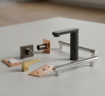
Here’s the thing: you can mix metals, but you need a strategy. Some designers say stick to two finishes max, others push three or even four if you’re confident. I’ve seen both approaches work and fail spectacularly, so the number isn’t really the point.
The Undertone Map That Actually Matters When Selecting Multiple Finishes
Warm finishes—brass, bronze, copper, gold—share yellow or reddish undertones. Cool finishes—chrome, stainless steel, polished nickel—lean blue or gray. This isn’t revolutionary information, but people still mix warm brass with cool chrome and wonder why their bathroom feels off. The secret isn’t avoiding mixes entirely; it’s choosing a dominant temperature and using the other as a deliberate accent, maybe 70-30 or 80-20 if you want a safer ratio. I guess it’s like color theory but for metal, which sounds pretentious until you realize your drawer pulls are arguing with your faucet.
Anyway, there are bridges. Brushed or satin finishes blur the warm-cool divide better than high-polish ones. A brushed nickel faucet can peacefully coexist with aged brass cabinet hardware because the matte texture softens both. Matte black works with everything—it’s the design equivalent of a black t-shirt, which is probably why it’s been everywhere for the past five years and shows no signs of leaving.
You also need to think about sheen consistency, which nobody tells you until you’ve already ordered mismatched fixtures.
Why Your Finish Choices Need Anchor Points Across Connected Spaces
Cohesion breaks down when finishes appear randomly, once each, scattered like design confetti. If you use oil-rubbed bronze on your kitchen faucet, it needs to show up again—cabinet hardware, light fixture, maybe a towel bar in the adjacent powder room. This creates visual threads that tie spaces together, especially in open floor plans where the kitchen bleeds into the dining area and you can see four different rooms from one spot. I’ve walked through homes where every room had different hardware finishes with no repeats, and it felt like touring a showroom rather than someone’s actual house, which maybe was the point but seemed exhausting.
The repeat doesn’t need to be literal or obsessive. You’re not matching bridesmaid dresses. If your dominant finish is brushed gold, maybe it appears on 60% of your hardware, with matte black as a supporting character on statement pieces—the range hood, a dramatic mirror frame, the stair railing if you’re feeling bold. The key is that someone walking through can subconsciously track the pattern, even if they couldn’t articulate it.
Honestly, I think the fear of mixing finishes comes from the permanence of the choice. Paint you can change in a weekend; hardware feels more committed, especially when you’ve drilled holes. But cohesion isn’t about perfection—it’s about creating a rhythm that feels intentional rather than accidental, which is harder to quantify but immediately obvious when you get it wrong. Wait—maybe that’s the real test: if you have to explain why your finish choices work, they probably don’t.


