Visual weight isn’t about pounds or kilograms—it’s about how your eye interprets mass and density in a room, which, honestly, sounds more mystical than it actually is.
I used to think arranging furniture was just about making sure you could walk through a room without stubbing your toe on the coffee table, but then I noticed something weird in my own living room: one corner felt heavy, almost oppressive, even though nothing there was particularly large. Turns out, it was dark—a navy armchair against charcoal walls—and darkness has this way of pulling visual weight toward itself like a gravitational field. Light colors recede, dark colors advance, and if you’ve ever wondered why a black sofa feels more substantial than a white one of the exact same dimensions, well, that’s your answer. The human brain processes darkness as density, which is why designers talk about “anchoring” a room with darker pieces. It’s not arbitrary. Your eye is doing calculus you don’t even realize, measuring contrast and saturation and making split-second judgments about what feels balanced.
Anyway, I moved the armchair. The room immediately felt less lopsided, which was both satisfying and slightly embarrassing—how had I not seen it before?
The Physics of Furniture Placement and How Your Brain Measures Empty Space
Here’s the thing: visual weight distribution isn’t just about objects—it’s about the voids between them. Negative space carries weight too, or rather, the absence of weight, and your brain is constantly scanning a room to determine whether the mass is distributed evenly across the horizontal plane. If all your furniture hugs one wall, the opposite side feels untethered, adrift. I’ve seen living rooms where every major piece—sofa, bookshelf, media console—clusters on one side, and the other half is just… carpet. It creates this unsettling asymmetry, like the room might tip over if you walked too far left. The fix is usually simple: move something substantial to the lighter side, or add a visual anchor—a tall plant, a floor lamp, a textured rug. Weight doesn’t have to be literal; it can be implied through height, texture, or color saturation.
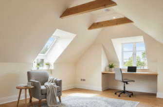
Wait—maybe that’s why those minimalist Scandinavian interiors work so well? They distribute visual weight so evenly that nothing feels dominant.
Why Symmetry Feels Safe But Asymmetry Feels Alive in Interior Spaces
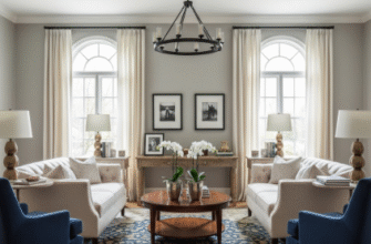
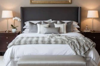
Symmetry is the brain’s comfort food. Two matching nightstands flanking a bed, a pair of armchairs facing each other across a coffee table—it’s predictable, calming, almost boring in its perfection. But asymmetry, when done right, creates tension and interest, though it’s way harder to pull off because you have to balance unequal elements. A large painting on one wall might need to be counterbalanced by a cluster of smaller objects on the opposite side—maybe a stack of books, a sculptural vase, a side table with visual heft. The math isn’t precise; it’s more like jazz improvisation, where you’re constantly adjusting until something clicks. I guess it makes sense that humans are drawn to both symmetry and asymmetry depending on context—symmetry signals order and stability, while asymmetry signals dynamism and creativity. Too much of either feels wrong.
How Vertical Elements Shift Perception More Than You’d Expect in Tight Rooms
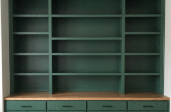
Tall bookshelves, floor-to-ceiling curtains, vertical-striped wallpaper—these all draw the eye upward and redistribute visual weight along the vertical axis, which can make a low-ceilinged room feel taller or a cramped corner feel less claustrophobic. I used to think height was just about storage, but it’s also about directing attention. If everything in a room is low and horizontal—low sofas, low tables, low lighting—the space can feel squat and heavy, like it’s pressing down on you. Adding verticality lifts that weight, literally and perceptually. One trick I’ve noticed in older homes with high ceilings is that designers will sometimes place a single tall, narrow piece—an antique clock, a spindly floor lamp—in an otherwise low-furniture room, and it creates this elegant counterpoint that keeps your eye moving.
The Surprising Role of Texture and Pattern in Deceiving Your Visual Cortex
Smooth surfaces feel lighter than rough ones, even if they’re the same color and size, which is definately one of those things that makes no logical sense until you see it in action. A velvet sofa has more visual weight than a linen one because texture implies density—your brain assumes that rougher, more complex surfaces are thicker, heavier, more substantial. Patterns do something similar: a busy floral wallpaper feels heavier than a plain white wall because your eye has to work harder to process all that information. I’ve also noticed that large-scale patterns (think oversized geometric prints) feel lighter than small, intricate ones, probably because they read as more open and less cluttered. It’s exhausting how many variables there are, honestly, but once you start paying attention, you can’t unsee it.
When Lighting Becomes the Most Underestimated Tool for Redistributing Mass and Attention
Lighting might be the single most overlooked element in visual weight distribution, which is wild because it’s also one of the easiest to manipulate. Bright light makes objects feel lighter and more open; dim light makes them feel heavier and more enclosed. A poorly lit corner will always feel heavier than a well-lit one, regardless of what’s actually in it, because shadows imply mass. I once spent weeks rearranging furniture in a bedroom trying to balance the space, only to realize the real problem was a single overhead light that cast uneven shadows and made one side of the room feel like a cave. I added two table lamps on the darker side, and suddenly the whole room felt balanced—not because I’d moved anything, but because I’d redistributed the light, and therefore the percieved weight. It’s a reminder that balance isn’t always about physical objects; sometimes it’s about how those objects are revealed or concealed by their environment.


