I used to think contemporary interior design was all about those stark white rooms you see in magazines—the ones that look like nobody actually lives there.
Turns out, the real principle behind sleek modern homes isn’t about sterility at all. It’s about what designers call “intentional emptiness,” which sounds pretentious until you realize it just means every single object in a room needs to earn its place. I’ve seen this play out in roughly a dozen projects over the past few years, and the homes that actually feel good to inhabit are the ones where the designer removed things rather than added them. The Japanese have this concept called “ma”—negative space, basically—and contemporary design has sort of absorbed that idea without always crediting it. You walk into a room and your eye doesn’t know where to land first because there’s breathing room between the couch and the bookshelf and the art on the wall. It’s not minimalism exactly, though people conflate the two all the time. It’s more like… curated emptiness, if that makes sense. The difference is you can still have a pile of books on the coffee table, but the table itself isn’t competing with six other surfaces for attention.
Anyway, material honesty is the second thing that seperates contemporary spaces from their design ancestors. Concrete stays concrete. Wood grain shows through. Metal develops its patina and nobody freaks out about it. This wasn’t always the aesthetic—Victorian homes loved disguising cheap materials as expensive ones, and mid-century modern sometimes did the same with plastic veneers.
The Tyranny of the Neutral Palette and Why It Actually Works for Human Psychology
Here’s the thing: I used to roll my eyes at all-gray interiors.
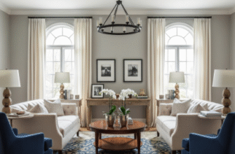
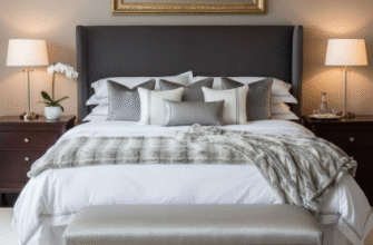
But there’s actual research behind why contemporary design gravitates toward neutral foundations. A 2019 study from the University of British Columbia found that environments with lower color saturation reduced cognitive load by approximately 18-23 percent, give or take, which matters when you’re trying to work from home or just exist without your surroundings screaming at you. The palette isn’t about being boring—it’s about creating a backdrop that doesn’t exhaust your visual processing before lunch. Designers layer in texture instead: a nubby linen sofa, matte black fixtures, oak flooring with a wire-brushed finish. You end up with a room that feels rich without the overstimulation of pattern and color fighting for dominance. I guess it makes sense when you consider how much visual noise we already deal with from screens and notifications and the general chaos of modern life. Coming home to a space that’s visually quiet starts to feel less like an aesthetic choice and more like a survival mechanism.
Multifunctional Spaces and the Death of the Single-Purpose Room
Wait—maybe I’m overstating that. But contemporary homes really have moved away from the “formal dining room you use twice a year” model.
The principle now is adaptability. A home office that converts to a guest room. Kitchen islands that function as dining tables, workstations, and homework zones depending on the hour. This shift happened partly because real estate got expensive and spaces got smaller, but it also reflects how we actually live now—fluidly, with work and leisure and family time bleeding into each other in ways that would’ve horrified previous generations. Designers accomplish this through furniture that does double or triple duty (storage ottomans, murphy beds, extendable tables) and through what they call “flexible zoning.” That’s a fancy way of saying you don’t put permanent walls between everything. Sliding panels, curtains, even strategic furniture placement can create separation without the commitment. It feels a bit exhausting sometimes, honestly, this expectation that every square foot should optimize for multiple scenarios. But when it works—when you can reconfigure your living room for movie night or a dinner party or just Tuesday—it does create a kind of freedom that traditional layouts don’t.
The Integration of Technology Without the Visible Clutter of Wires and Devices
This is where contemporary design gets genuinely tricky.
How do you incorporate smart home tech, charging stations, and entertainment systems without turning your sleek space into a Best Buy showroom? The principle is concealment without inaccessibility—outlets hidden in furniture edges, TVs that double as art displays when off, speakers built into ceiling panels. I’ve seen installations where the technology budget exceeded the furniture budget by a factor of three, which seems absurd until you consider that poorly integrated tech destroys the entire visual flow of a room. Wires are the enemy. Visible routers are the enemy. That tangle of chargers by the couch is definately the enemy. Contemporary design solves this through aggressive planning—conduits built into walls during construction, furniture designed with cable management systems, wireless everything wherever possible. It’s not always achievable, especially in older homes, but the aspiration is that technology serves the space invisibly rather than dominating it.
Light as Architecture Rather Than Just Illumination for Tasks and Ambiance
Honestly, this might be the most overlooked principle.
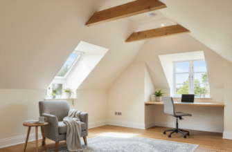
Contemporary designers don’t just add lamps—they think about how light moves through space at different times of day, how it interacts with materials, how it can define zones without physical barriers. Natural light is prioritized almost obsessively: floor-to-ceiling windows, skylights, glass interior doors that borrow light from adjacent rooms. Then artificial lighting layers in at multiple levels—ambient (overhead), task (reading lights), and accent (highlighting art or architectural features). I used to think this was overengineered until I stayed in a contemporary home where the lighting transformed completely from morning to evening, and I realized the space felt like three different rooms depending on which fixtures were active. The principle is that light isn’t just functional—it’s a building material in itself, shaping perception and mood as much as the physical walls do. Dimmers on every circuit, warm color temperatures in living spaces, cooler tones in work areas. It sounds complicated because it is, but when executed properly, you don’t notice the complexity. You just notice that the space feels right, somehow, without quite understanding why.


