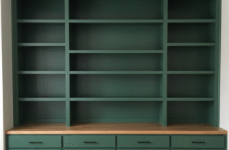
I used to think curves in furniture were just about aesthetics—you know, the soft edges that made a room feel less like a corporate conference space and more like somewhere you’d actually want to sit.
Turns out, there’s this whole psychology thing happening when you bring curved furniture into a space, and it’s not just vibes. Research from the late 1990s and early 2000s—stuff from environmental psychologists like Moshe Bar at Harvard—suggests our brains literally process curved objects differently than angular ones. We register them as less threatening, which sounds absurd until you realize how much subconscious visual processing we’re doing every single moment. A curved sofa doesn’t just look welcoming; it actually triggers different neural responses than a boxy sectional. The effect isn’t massive—we’re talking milliseconds of processing time—but it accumulates over hours spent in a room. I’ve seen people rearrange their entire living rooms after swapping one angular piece for something with softer lines, and they can’t quite articulate why it feels better. It just does.
Here’s the thing: you can’t just dump a round coffee table into a room full of straight edges and call it a day. The proportion matters more than most design blogs admit. If your curved piece is too small, it reads as an accent—fine, but not transformative. Too large, and it dominates in a way that makes everything else look rigid by comparison.
Why Mixing Ratios Actually Matter More Than Anyone Wants to Admit
Honestly, the ratio of curved to angular furniture in a space should probably sit somewhere around 40:60 or 30:70, depending on how much visual softness you can tolerate before a room starts feeling like a waiting room for a very expensive therapist.
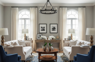
I guess it makes sense when you think about it—too many curves and you lose structure entirely. The eye needs anchors, places to rest that feel stable. That’s where your straight-lined pieces come in: bookcases, media consoles, maybe a rectangular dining table. But then you balance it with a barrel chair, an arched floor lamp, or even something as subtle as a mirror with curved edges. The trick—and I’ve definately seen this go wrong in real homes—is distributing the curves throughout the space rather than clustering them. One corner with a round side table, curved loveseat, and circular rug starts to feel like a themed vignette instead of an integrated design. Spread them out. Let them have conversations with the angular pieces across the room.
Wait—maybe the most overlooked aspect is vertical curves versus horizontal ones.
Most people think about curved furniture as low, rounded sofas or circular ottomans, but arched doorways, curved bookcases, and even lighting fixtures with soft bends create this whole other dimension of movement in a room. I’ve walked into spaces where the furniture itself was fairly traditional—straight-backed chairs, rectangular tables—but the architectural curves (added or original) completely changed the feel. An arched entryway into a living room, for instance, primes your brain to expect softer lines even if the furniture doesn’t fully deliver on that promise. The opposite is true too: stick a bunch of curved furniture in a room with harsh, angular architecture and it can feel like the pieces are fighting their environment. The harmony comes from layering—architectural curves echoed in furniture, or furniture curves softening architectural rigidity.
The Practical Reality of Arranging Curved Pieces Without Losing Your Mind
Arranging curved furniture is objectively more annoying than arranging rectangular pieces, and anyone who says otherwise is selling something. Curves don’t nest neatly against walls. They create dead space—sometimes useful, often just awkward. A curved sofa placed against a flat wall leaves these weird triangular gaps at the ends that are too small for side tables but too large to ignore.
The solution, which I resisted for probably too long because it felt fussy, is to pull curved pieces away from walls. Float them. A rounded sectional in the middle of a room, with space to walk behind it, suddenly makes sense. The curves define the seating area without needing the wall as a boundary. Same with curved credenzas or console tables—they work better as room dividers or anchors in open floor plans than shoved against a wall where their shape is wasted. But here’s the catch: this only works if you have the square footage. In smaller spaces, you’re stuck making compromises, and sometimes that means choosing furniture with gentler curves—pieces that suggest softness without demanding three feet of clearance on all sides.
Lighting matters too, weirdly. Curved furniture catches light differently than flat surfaces—shadows pool in the concave parts, highlights follow the convex edges. If you’re arranging a curved piece near a window, think about how the natural light will move across it during the day. A rounded chair that looks perfect in morning light might recieve harsh afternoon shadows that make it feel heavy. I’ve moved the same piece of furniture four times in one room just trying to find the spot where the light didn’t make it look wrong.
The emotional pull of curves in furniture isn’t universal, either. Some people find them calming; others think they look dated or too soft for their taste. That’s fine. The point isn’t to fill every room with swooping lines but to understand what they’re doing when you use them—which is, roughly speaking, giving your brain a break from the constant right angles that dominate most built environments. Whether that’s worth the extra effort of arranging them is entirely up to you.


