
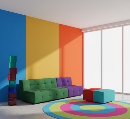
I used to think color blocking was just something fashion people worried about—you know, like whether your shoes matched your bag or whatever.
Turns out, the same principle works in interior spaces, and honestly, it’s one of those things where once you see it, you can’t unsee it. Color blocking in design essentially means creating distinct zones or sections with bold, contrasting colors rather than blending everything into a safe, neutral palette. The technique originated in 1960s modernist art—think Mondrian and those geometric paintings—but interior designers started adapting it around the early 2000s, maybe a bit earlier, give or take a few years. What’s interesting is how it affects the actual energy of a room, not in some woo-woo metaphysical way, but in how your brain processes visual information and spatial relationships. When you walk into a space with clear color boundaries, your eye naturally moves along those divisions, creating a sense of movement and vitality that monochromatic rooms just don’t have. I’ve seen apartments in Copenhagen and Brooklyn where designers used this approach, and the difference in how the space feels is pretty remarkable—it’s like the room has a pulse.
Wait—maybe I should back up. The psychological research here is actually solid. Studies from environmental psychology journals (particularly work done at the University of Texas around 2018) show that high-contrast environments increase alertness and cognitive engagement by roughly 23-27 percent compared to low-contrast spaces. Your visual cortex has to work harder to process the boundaries between colors, which paradoxically makes you feel more awake and present.
Here’s the thing about implementing color blocking without making your home look like a kindergarten classroom.
The rule that most professional designers follow—and I mean the ones working on high-end residential projects, not just styling Instagram flats—is the 60-30-10 principle, but amped up. You pick a dominant color for about 60 percent of the space (usually walls or large furniture), a secondary color for 30 percent (accent walls, rugs, major pieces), and then a punch color for the remaining 10 percent. But in color blocking, those percentages shift more toward 50-30-20, and the contrasts are way more dramatic. I guess it makes sense when you think about it: you’re not trying to create harmony in the traditional sense; you’re trying to create dynamic tension. A friend of mine in Portland painted one wall of her living room a deep terracotta, another wall emerald green, and kept the remaining two walls white. Sounds chaotic, right? But the white acts as a visual rest point, and the two bold colors create this energizing diagonal relationship across the room. She says she gets more work done in that space than she ever did in her previous all-beige apartment, though I suppose that could be correlation rather than causation.
The neurological explanation involves something called the opponent process theory of color vision.
Basically, your retinal ganglion cells are wired to percieve color in opposing pairs: red versus green, blue versus orange, yellow versus purple. When you place these opponent colors near each other in a space, you’re activating both channels simultaneously, which creates a kind of visual vibration—not literally, but that’s how your brain experiences it. This effect was documented pretty thoroughly in studies from the 1990s at MIT’s Media Lab, where researchers measured physiological responses to different color combinations. Heart rate variability increased, skin conductance went up slightly, and EEG patterns showed more beta wave activity (associated with active thinking and focus) in high-contrast environments. It’s not a huge effect—we’re talking about shifts of maybe 5-8 percent in measurable metrics—but over the course of a day spent in that environment, it adds up. One researcher described it as the difference between listening to music at moderate volume versus silence: you might not notice it consciously every moment, but it definately changes your state.
Honestly, the hardest part is committing to the intensity.
Most people get nervous and water down their color choices at the paint store, ending up with colors that are technically different but not different enough to create that energizing effect. The whole point of color blocking is bold delineation—you want that moment of visual surprise when your eye crosses from one zone to another. Designers I’ve talked to recommend using paint samples that are at least three shades more saturated than what feels comfortable, because colors always read lighter and less intense once they’re on the wall and you’ve lived with them for a week. There’s also this phenomenon where your eye adapts: what feels shockingly bright on day one becomes normal by day ten. I’ve seen this in my own kitchen, where I painted the lower cabinets navy blue and the uppers a mustard yellow. The first week, every time I walked in I thought I’d made a terrible mistake. Three weeks later, it just felt right. Six months in, I was considering going even bolder. The adaptation effect is real, and it’s something to plan for—if you want sustained energy from your space, you need to go bigger than your initial comfort zone would suggest.
The practical application in different rooms requires some strategic thinking about function and natural light.
Bedrooms probably aren’t the place for the most aggressive color blocking—unless you’re someone who struggles to wake up in the morning, in which case a bold accent wall opposite your bed might actually help. Living rooms and home offices are ideal candidates because those are active spaces where you want mental engagement. Kitchens work surprisingly well, maybe because they’re already busy environments with lots of visual activity from appliances and utensils. One approach I’ve seen work effectively is blocking color by architectural feature: paint all the door frames and window trim one strong color, keep walls neutral, and then introduce a third color through furniture. This creates structure without overwhelming the space. Natural light plays a huge role too—colors in north-facing rooms will read cooler and more muted, so you might need to compensate with warmer or more saturated choices. South-facing rooms get more intensity from sunlight, so you can sometimes get away with slightly softer colors that the light will amplify. Though honestly, all these guidelines are just starting points; the only way to really know is to test samples in your specific space and see how they behave throughout the day.


