
I used to think throw pillows were basically decorative lies—expensive little squares that you toss on the floor the second you want to actually sit down.
Then I spent three months researching textile design for a story about Moroccan weavers, and somewhere between interviewing a woman who’d been dyeing wool for forty years and sitting in a London showroom surrounded by velvet samples that cost more per yard than my first car, I realized I’d been thinking about this all wrong. Pillows aren’t about comfort, not really—they’re about creating visual weight, about giving your eye somewhere to land when you walk into a room, about making a sofa look like it belongs to someone who makes decisions with confidence, even if you spent twenty minutes that morning trying to remember where you put your keys. The right pillow can make a $400 IKEA sofa look considered and intentional. The wrong one makes a $4,000 designer piece look like it wandered in from a hotel lobby circa 2003. And here’s the thing: the rules for choosing them are way less rigid than the home decor Instagram accounts want you to believe, but they’re also more specific than just “pick what you like.”
The Geometry of Not Looking Like You Tried Too Hard (But Also Not Like You Gave Up)
Start with scale, because that’s where most people quietly fail without realizing it.
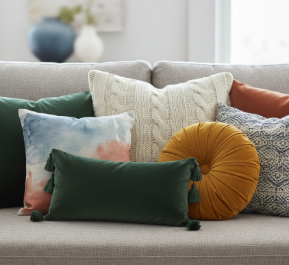
If your sofa is 84 inches or longer—and honestly, most sectionals and standard three-seaters fall into this range—you want pillows that are at least 20 inches square, maybe even 22 or 24 if the sofa has a deep seat or high arms. Smaller pillows, like those sad little 16-inch squares, they just disappear visually, and you end up with this weird effect where the sofa looks underdressed, like it showed up to a dinner party in a t-shirt. I’ve seen people use five or six small pillows to try to compensate, and it always looks frantic, like the sofa is nervous. Two or three larger pillows, though—maybe one 24-inch, two 20-inch, or even just a pair of oversized 22-inch squares flanking a lumbar pillow—that reads as intentional. You want the pillows to feel like they’re in conversation with the sofa’s proportions, not fighting them or, worse, getting swallowed by them.
Lumbar pillows—the rectangular ones, usually 12×20 or 14×26—are weirdly underused, and I’m not sure why, because they’re the easiest way to add visual variety without making things look chaotic.
They break up the monotony of squares, they give you a spot to layer a different texture or pattern, and they actually work for lower-back support if you’re the kind of person who sits down to read instead of just scrolling on your phone standing in the kitchen. But—wait, maybe this is just me—I think they only work if you commit to the layering. A single lumbar pillow floating alone on a sofa looks unfinished, like you started decorating and then got distracted. You want it in front of a larger square, or flanked by two squares, so it looks like part of a composition rather than an afterthought.
Texture, Pattern, and the Delicate Art of Organized Chaos
Here’s where it gets messy, in a good way.
You’ve probably heard the advice to mix textures—velvet with linen, maybe a chunky knit or a nubby bouclé—and yes, that works, but not for the reasons people usually say. It’s not about “adding interest” in some vague aesthetic sense; it’s about creating micro-contrasts that keep your eye moving, so the sofa doesn’t read as a single flat plane of color. I talked to an interior designer in Copenhagen last year who said she never uses more than two textures on one sofa because three starts to feel like a craft fair, and I think she’s probably right, though I’ve definately broken that rule in my own living room and been fine with it. The trick, I guess, is that one texture should dominate—maybe two velvet pillows and one linen—so there’s a clear hierarchy instead of a bunch of equal players competing for attention.
Pattern is trickier, because it’s where things can go wrong fast.
The old rule is one patterned pillow, the rest solids, and that’s safe but also kind of boring. What actually works better, in my experience, is two patterns that share a color but differ in scale—like a large-scale ikat or suzani print paired with a smaller geometric or stripe. The shared color ties them together; the different scales keep them from visually canceling each other out. But you have to be careful about contrast levels. A high-contrast black-and-white pattern next to a soft watercolor print will just look confused, like they’re from different rooms that got mashed together by accident. And if you’re going with all solids, which is totally valid and often looks more expensive, then you need to vary the tones—not matchy-matchy same-color solids, but a warm cream next to a cool grey next to a soft terracotta, something like that, so there’s depth.
The Stuff Nobody Tells You Until You’ve Already Bought the Wrong Pillows
Filling matters more than you think.
Down or feather inserts look plush and expensive because they compress a little when you lean against them, which creates these natural folds and shadows that make the pillow look lived-in rather than stiff. Polyester-fill pillows—especially the cheap ones—they hold their shape too rigidly, and they photograph well in online listings but in person they look like they’re holding their breath. If you’re going to use poly-fill for budget or allergy reasons, at least get ones that are overstuffed slightly, so there’s some visual give. Also, and this is weirdly specific, but pillow covers should be about an inch smaller than the insert, so the insert fills them out properly. A 20-inch insert in a 20-inch cover looks deflated; a 20-inch insert in an 18-inch cover looks full and intentional.
Color is the last thing, and maybe the most personal.
If your sofa is neutral—grey, beige, cream, that whole safe zone—then pillows are where you bring in color, but not necessarily bold color. I used to think “accent pillow” meant bright, but actually the most succesful pillow arrangements I’ve seen use colors that are just a few shades darker or more saturated than the sofa itself, so there’s contrast without drama. A charcoal pillow on a light grey sofa. A rust pillow on a tan sofa. It’s subtle, but it makes the sofa look anchored instead of floating in space. If you do want a pop of color—teal, mustard, whatever—keep it to one pillow, and make sure it pulls from something else in the room, even if it’s just a spine of a book on the shelf, so it doesn’t look random.
Anyway, I guess what I’m saying is that throw pillows are a small decision that has an outsized impact on whether a room feels finished or not, and the good news is that you can experiment cheaply by swapping out covers instead of buying whole new pillows every time you change your mind.


